GO2bank, a new mobile banking product from Green Dot, was designed for the underbanked, who often face challenges with traditional banks due to poor credit or financial history. It marked a strategic shift from the original Green Dot app, driven by new leadership. The product initially introduced Overdraft Protection (ODP) to help users avoid fees and overspending; however, upon release, the feature was not used as widely as hoped.
View Figma hereDesign lead: fine-tuned requirements, helped product with design strategy, end-to-end experience, and conducted testing
One week until handoff to dev team
Product (PM), dev team, product copywriter, and compliance
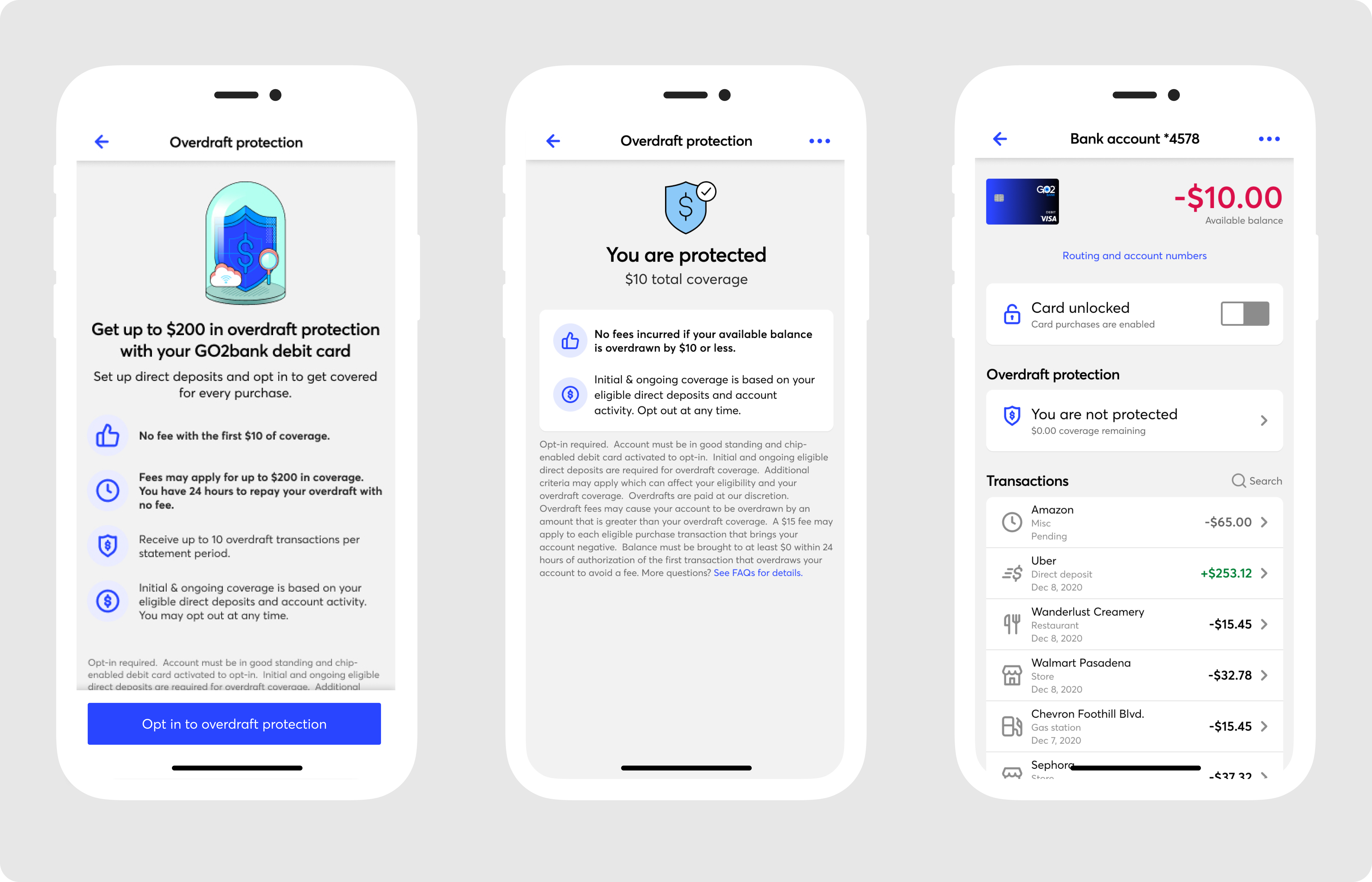
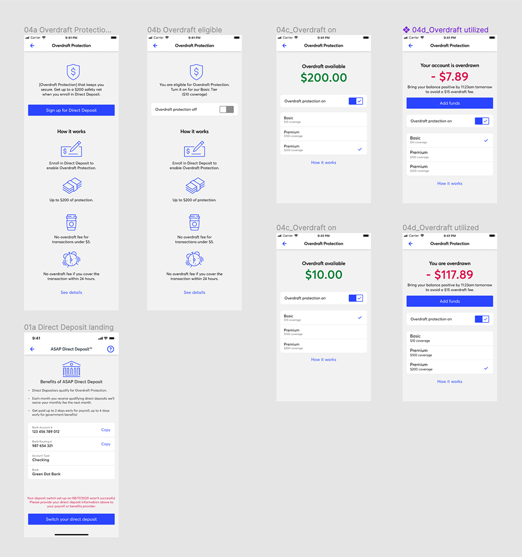
The problem: The previous overdraft feature lacked transparency and clarity, leaving many customers confused and uncertain about how it worked. Due to the uncertainty around the ODP feature, many users did not opt-in and utilize it.
The goal: The objective was to rethink the overdraft experience that was clear, transparent, and straightforward.

Revisiting: I reviewed the initial data, revisited past research, and analyzed the competitive market. However, during this process, I noticed something in the usability testing and user interviews that were conducted prior. The initial user interviews and testing before the app launch appeared positive, with no signs of confusion around the feature. However, post-launch feedback revealed a different story. Upon further investigation, I identified that the testing lacked proper user screening and included leading questions, which skewed the results and led to biased feedback.
Early stage generative research: Before diving into iterations, I conducted interviews with active GO2bank customers to better understand our typical users. These conversations helped uncover insights into their daily lives, reasons for choosing GO2bank, and their current financial needs and goals.
Research findings: We discovered that users' poor credit wasn’t just due to a few bad decisions — it stemmed from a deeper issue. Interviews revealed a widespread lack of basic financial knowledge, from understanding credit to managing spending. Many faced generational financial illiteracy, fueling a cycle of poverty and low credit. This led our data and research team to conduct additional interviews, which confirmed these findings.
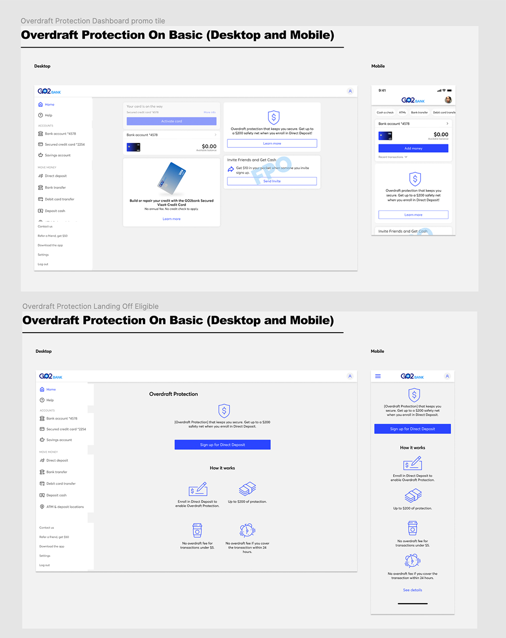
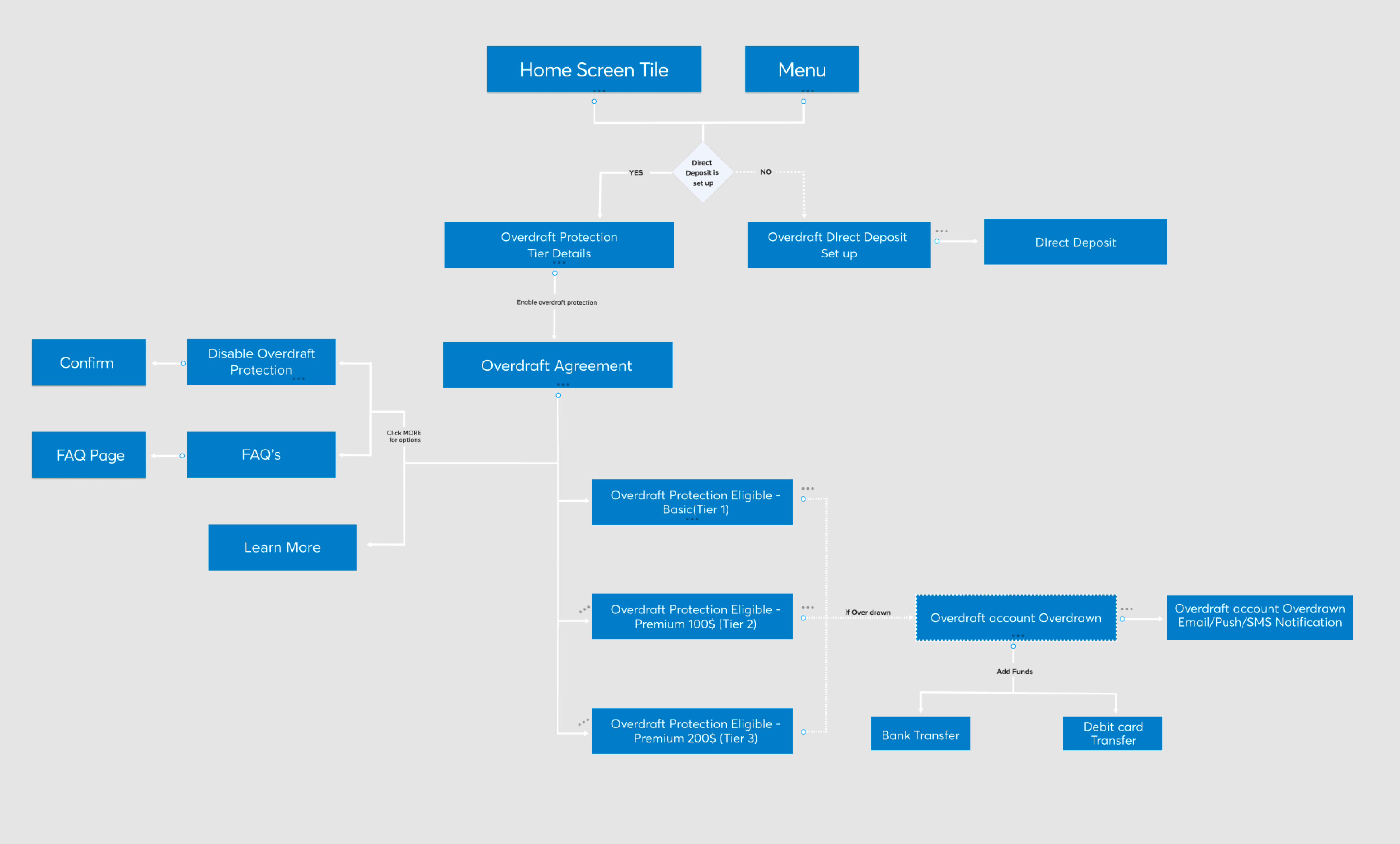
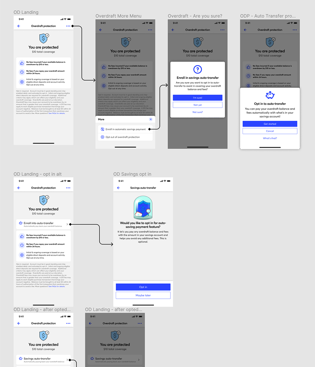
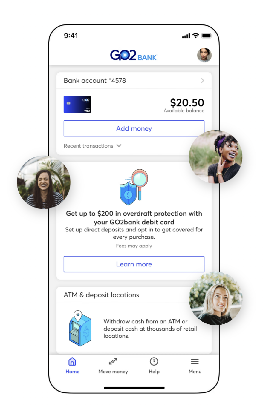
Following up: Based on design's discovery on active users, we took a step back and decided to rethink product decisions, such as requirements. Product and design met to discuss how we could alleviate this burden from our users. We knew we needed to provide greater clarity to our users with more detailed product copy, but we also recognized the need to improve the opt-in experience. This included offering more context before and during the opt-in process, and clearly indicating when users have opted in.
Once we redefined our requirements based on the testing/research results, design led the way for bringing requirements to life. Having gone through many rounds of reviews and iterations within a tight time-frame, we were able to confirm the proper direction to get our users utilizing ODP.
Originally, the team as a whole aimed to avoid making drastic changes from the initial ODP experience in the redesign. However, after exploring several options and going through the validation process, we found it was better to move away from the original design.
Part of the pain was stemming from the overall design looking too "simplistic" where users felt that there wasn't enough information presented. This caused users to stray away from opting into the feature.
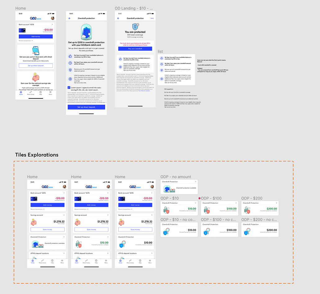
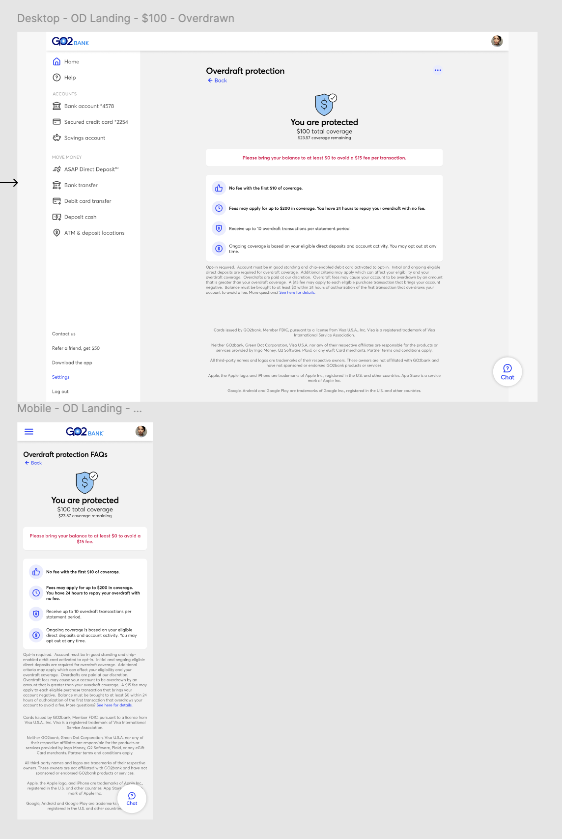
In a sample of 25 active GO2bank customers, we asked various questions about the feature, gathering feedback on their thoughts before and after testing prototypes of both the old and new designs. Users consistently highlighted the improved clarity in the copy, preferring straightforward language over "insurance" or "banking" jargon. They also found the design and overall content on the landing screen much clearer before opting in, which made them feel enticed to use this feature.
— DREAMSTAR (Female, Age 29)
The redesigned ODP feature screen received positive feedback for its clarity and concise information, leading to increased user engagement. We saw a significant rise in users interacting with the ODP feature, with opt-ins growing from ~35% to ~70% of active users. ODP has since become one of our most valued features and is a key focus in our ongoing UX refresh project.
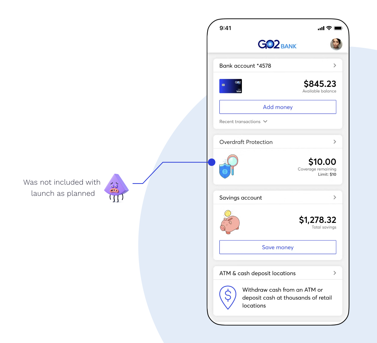
I initially faced inaccurate user data, which led to misunderstandings about our users and their needs. Once I gained better insights, the project scope expanded significantly. Despite this, design was still given just one week to finalize and hand off the designs. This tight deadline not only put pressure on the design team but also strained the development team. After handoff and testing, the engineering team pushed back due to time constraints, leading to some features originally planned for the launch being descoped.