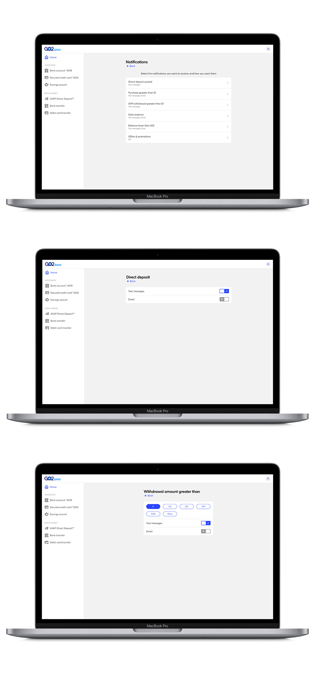
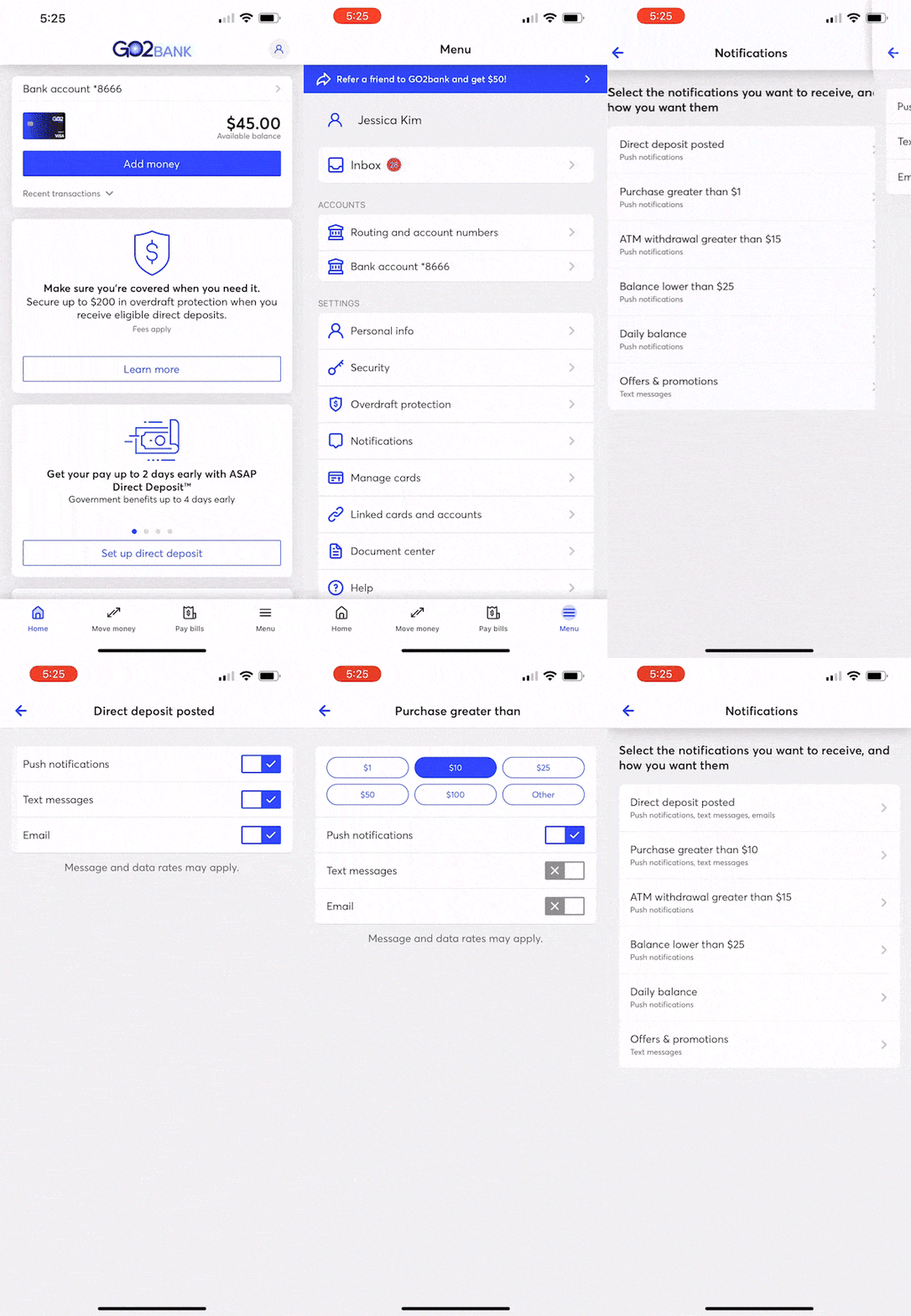
GO2bank, a mobile app designed to empower and serve the underbanked, launched with a range of features to provide flexible and intuitive financial management. Among these is the notifications feature and settings, located in the user's settings menu, allowing users to customize the alerts they receive. This feature empowers users with control over what financial updates they see or hear, offering a personalized experience that keeps them connected to their finances with ease.
Design lead: assisted in refining requirements and designing the end-to-end experience.
8 days
Product (PM), dev team, and product copywriter
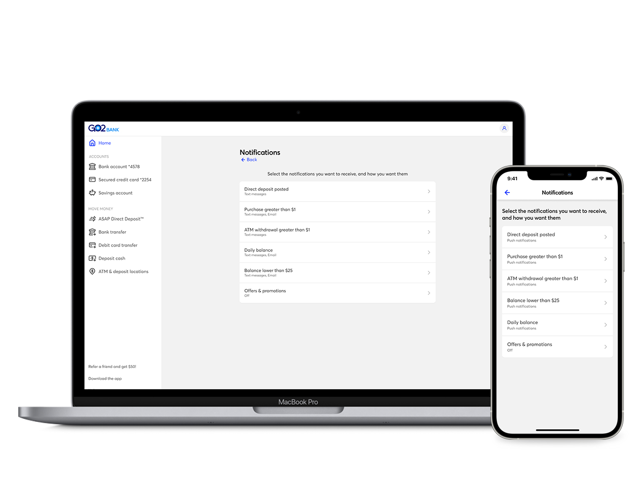
Notifications are a crucial feature of any mobile product, especially for a banking app. GO2Bank's notification settings empower users to personalize the alerts they receive based on specific features and scenarios. Recognizing the importance of this functionality to the user experience, we prioritized designing a seamless and intuitive process for customizing notifications.
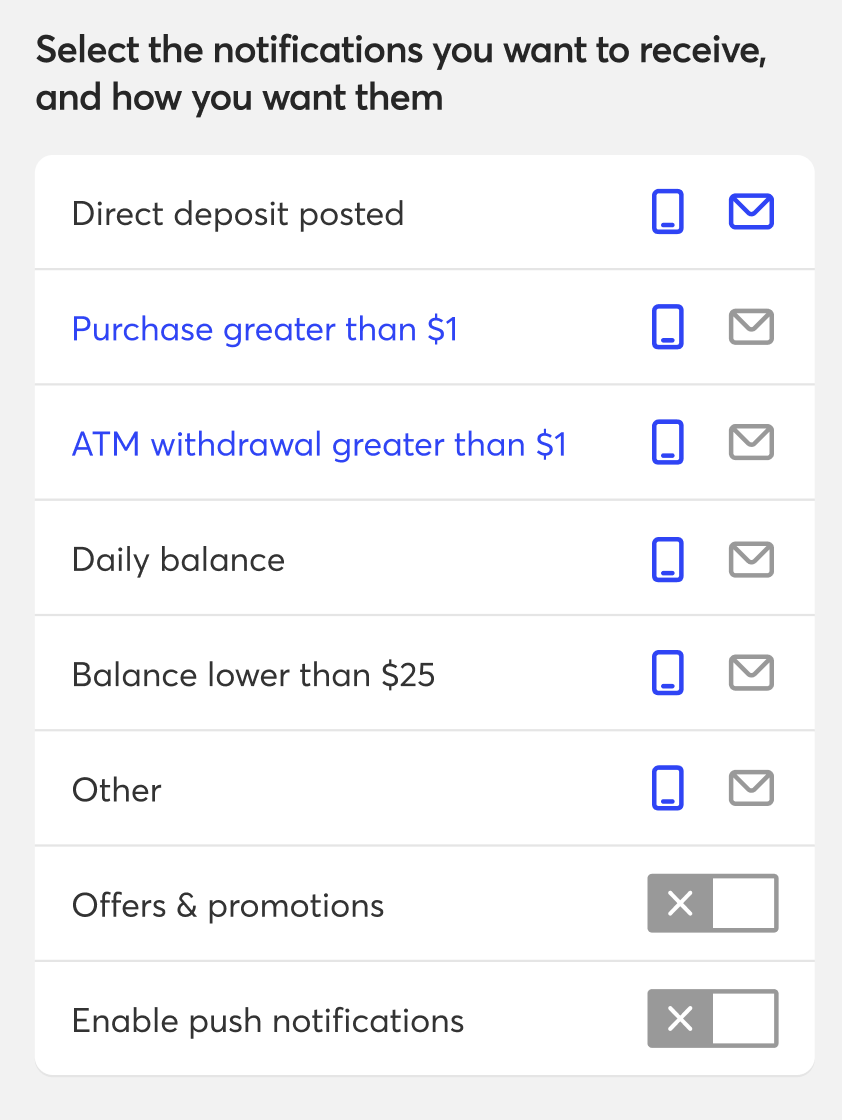
The problem: Users experienced confusion when setting up or adjusting their notifications through the settings. The primary issue was the overwhelming layout, which combined multiple categories on a single screen. This, along with the inconsistent application of design system elements, made the process less intuitive.
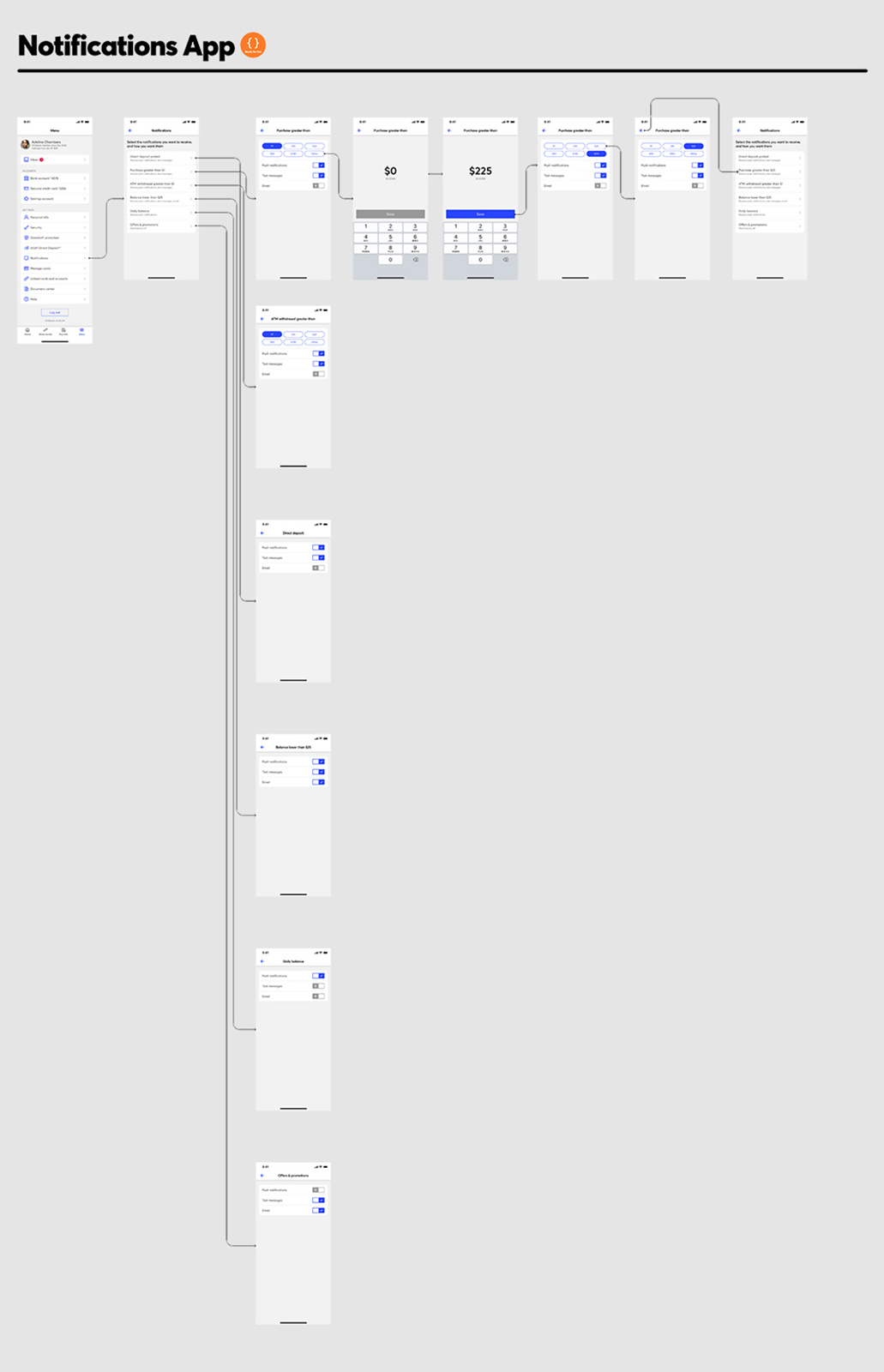
The goal: Reevaluating and restructuring the placement of information became a top priority. To address user confusion, we opted to separate content into distinct sections. This approach eliminated the clutter of cramming all information onto a single screen for each category. By doing so, we gained additional space to provide more context and guidance for users, while also incorporating more user-friendly design elements pulled from our exitaing library.
Initial data: Initial data from the product team revealed that users rarely revisited notification settings after their first session. However, during their initial visit, users frequently navigated back and forth between the main menu and the notification settings screen, spending a significant amount of time on the latter. This behavior suggested a mix of confusion about the available options and a sense of disorientation. To investigate further, we conducted usability testing and user interviews.
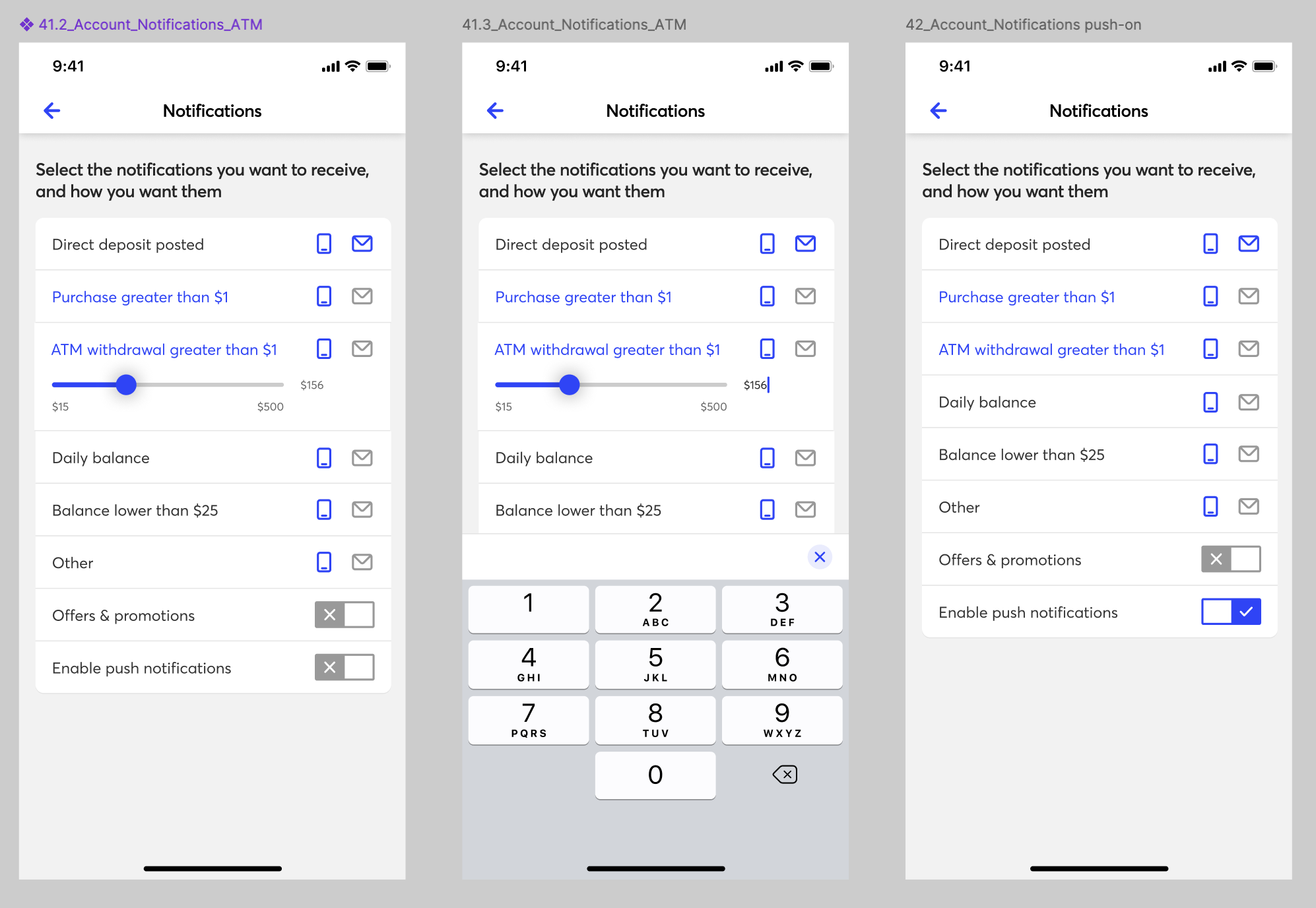
Explorations: After reviewing the initial data and discussing insights with the product team, I revisited the design for notification settings. I began by deconstructing the panels from version 1, aiming to assign each panel its own dedicated page or screen. This approach allowed us to provide more detailed information on secondary screens, giving users clearer options to customize their notifications. After several iterations, the team and I aligned on the strongest concepts, developed a prototype, and prepared for testing.
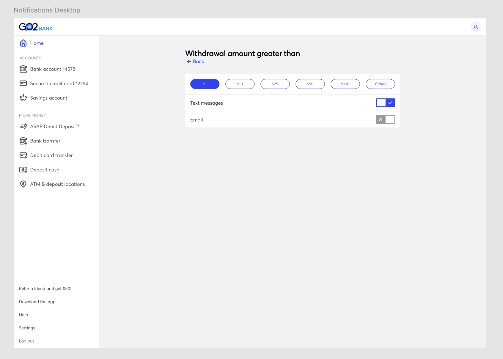
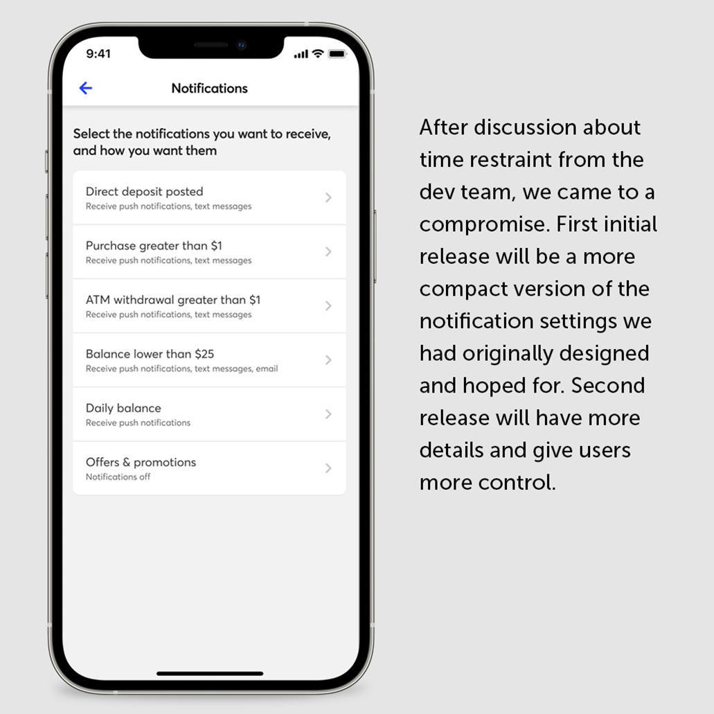
Curve ball: Due to unforseen circumstances around product planning, there was a time deduction. This meant design had timeline shortened and we made the difficult decision to not move forward with testing due to resource and timing conflict. This also meant, in addition to no longer move forward with validation, dev team also had less time to code. This resulted in many categories being removed from the initial push for V2.
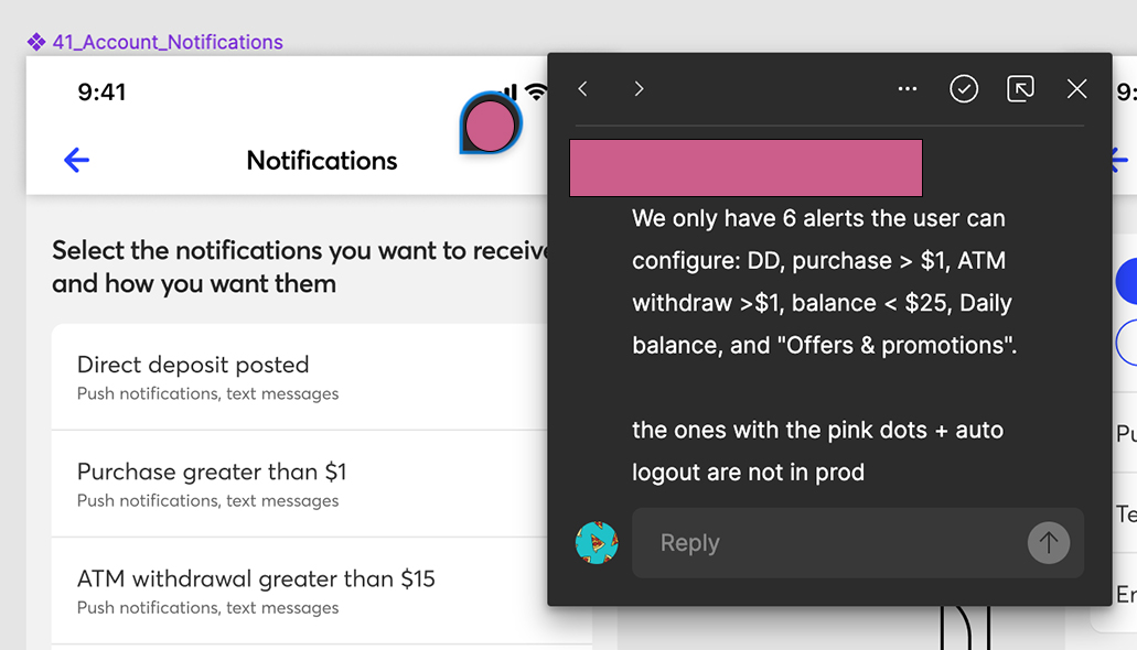
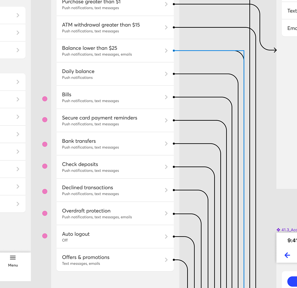
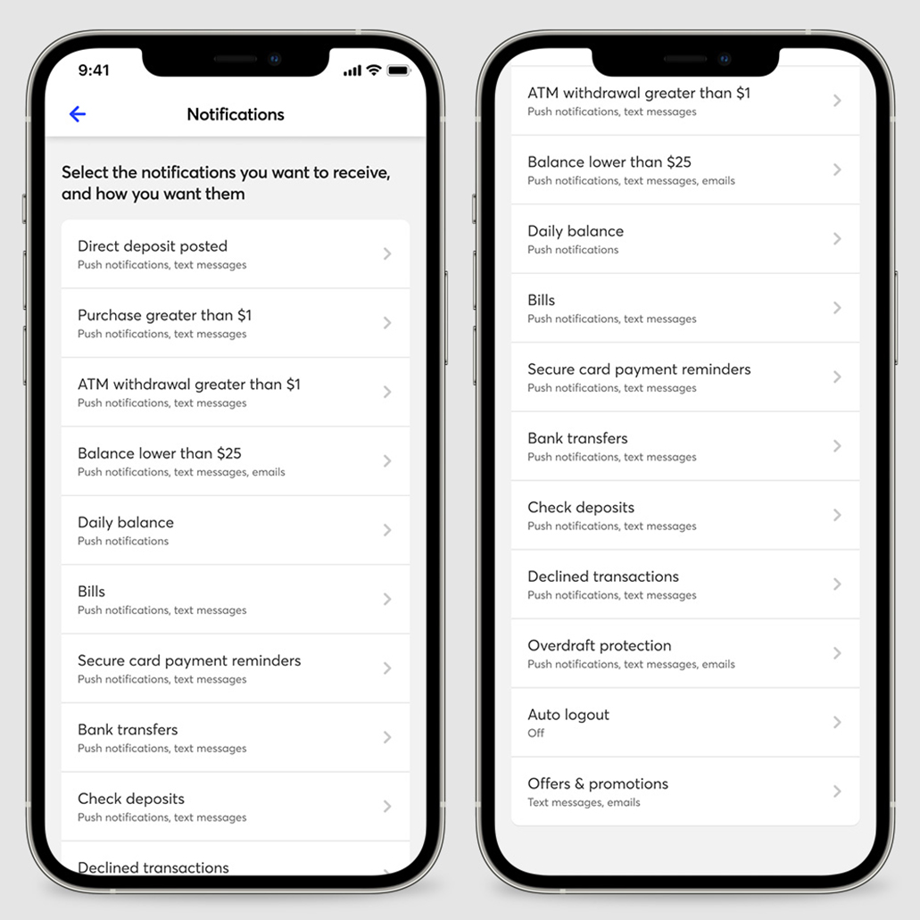
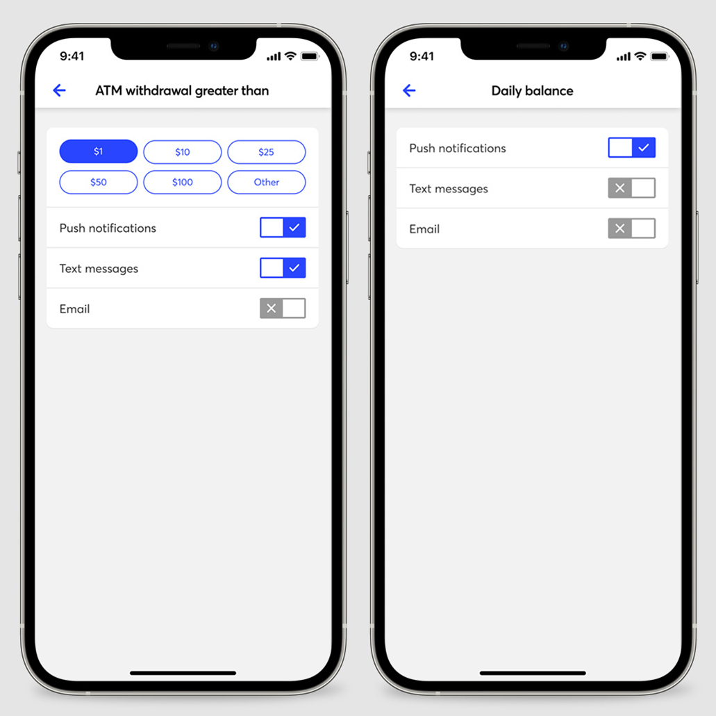
While the final outcome wasn’t exactly what my team and I had envisioned for our users, we worked within the constraints and collaborated to deliver the best possible solution under the circumstances. The refined design and improved user experience resulted in users no longer navigating back and forth between different settings screens—a clear indication of enhanced clarity.
