Norton LifeLock (formerly Symantec and now Gen) is a brand centered on comprehensive digital security, known for products like Norton Anti-Virus and an array of mobile security solutions. Norton360, a suite offering multiple security features, was conceptualized and initiated by Norton’s internal design team.
Design lead for iOS: defined design strategy, refined requirements, designed end-to-end experience, and conducted various testing
5 months for design, additional 5 months until roll out
2 PMs, 2 dev teams, 2 product copywriters, compliance, marketing, and 2 additional designers
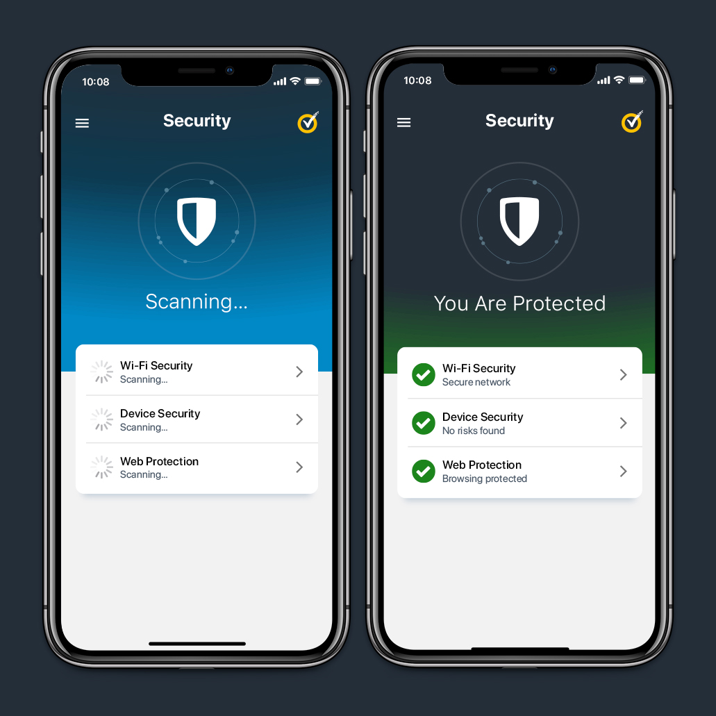
Norton360 is a mobile security solution designed for individuals who prioritize cybersecurity, offering comprehensive protection for personal information and device security. The product unified multiple security features into a single, user-friendly platform, addressing feedback from our customers.
The problem: In our endeavor to solve the main user painpoints (many users expressed frustration with the inconvenience of managing and logging into multiple standalone Norton products, prompting this streamlined approach of creating a suite), we also faced significant challenges. Norton embarked on a rebranding journey following the sale of a portion of Symantec to Broadcom. As part of this transition, we renamed the consumer-facing division, formerly known as Symantec, to Norton — a household name recognized by many. However, we encountered a lack of concrete requirements or a clear roadmap outlining which features and products would be integrated into this new, streamlined offering.
The goal: To rethink how to make login and managing multiple feature-based products easier for our users, but also managing the rebranding process and a revamp to our design systems and library, all at the same time seamlessly.
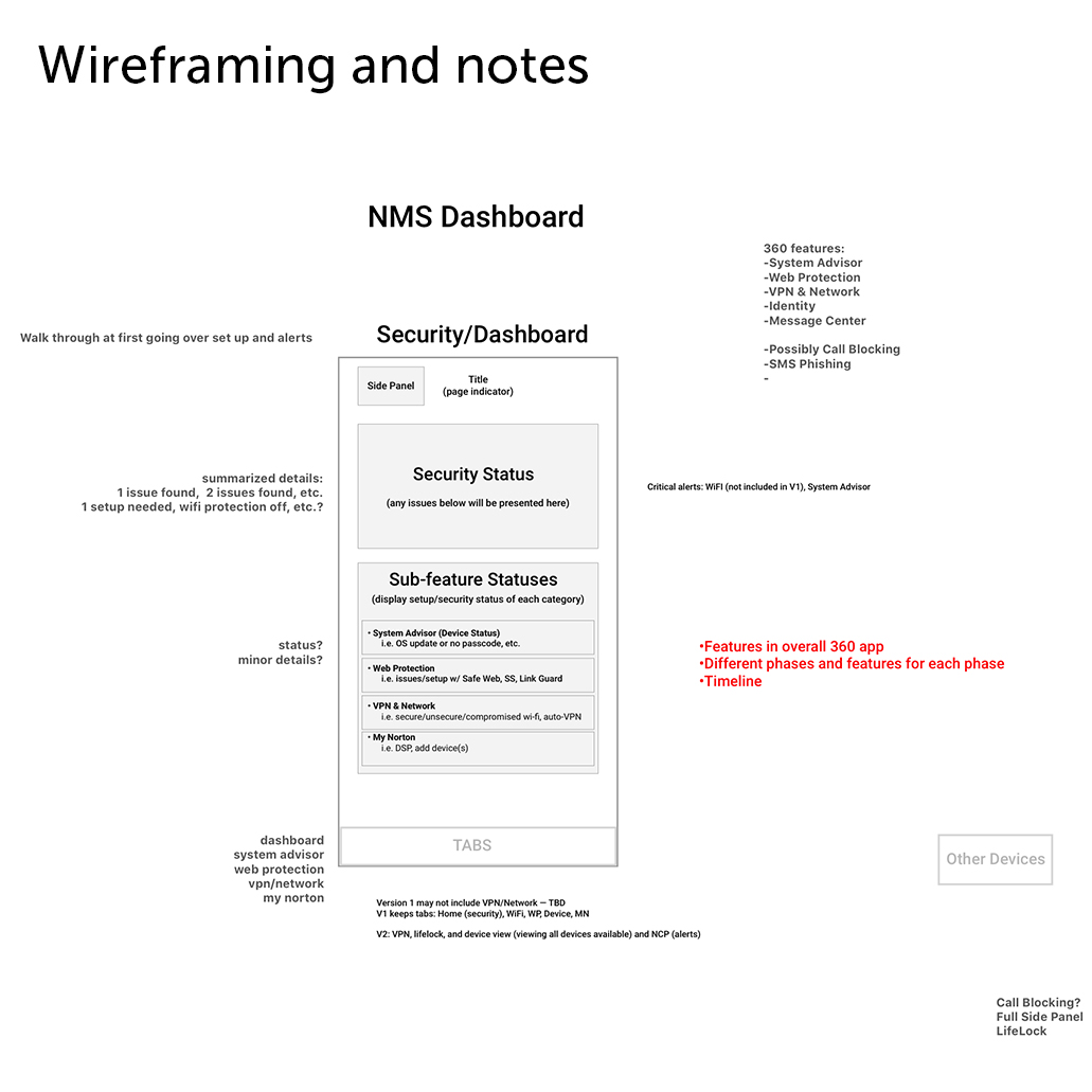
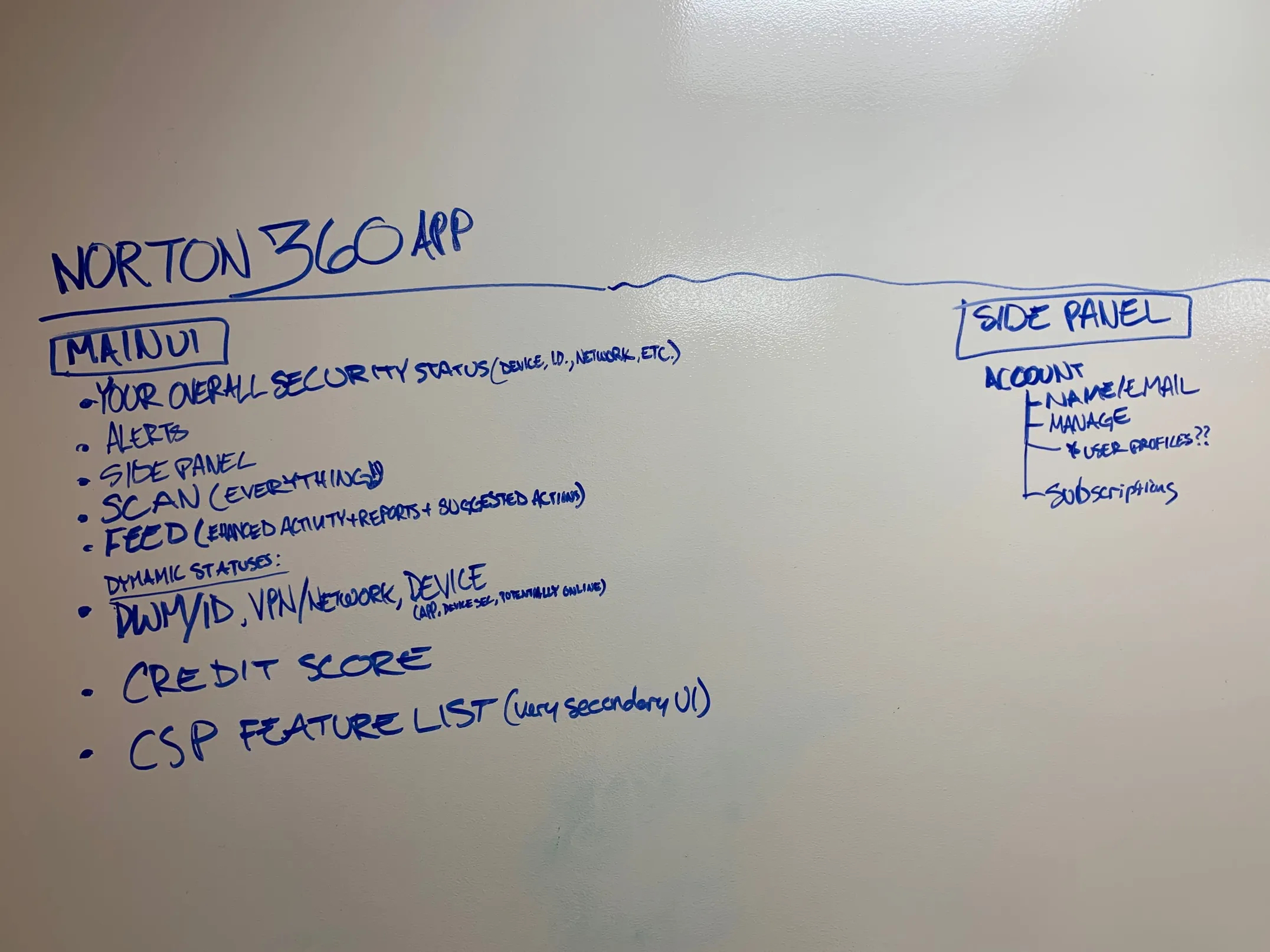
The design team took the initiative to kickstart the ideation process and facilitate discussions to resolve this constant user feedback. Without established requirements from project managers or developers, and with uncertainty lingering within the design team, we embarked our journey on wireframing, crafting user flows, and envisioning what we deemed to be the optimal security product (we decided this during discussions and brainstorming with gathered data). Our approach was guided by our understanding of our customers' preferences and security priorities—identifying which products they relied on most and pinpointing their major concerns. This initial brainstorming and exploration phase spanned three months, involving iterative exchanges with project managers and insights gathered from the development teams. Subsequently, we delineated basic requirements and formulated schedules and release plans.
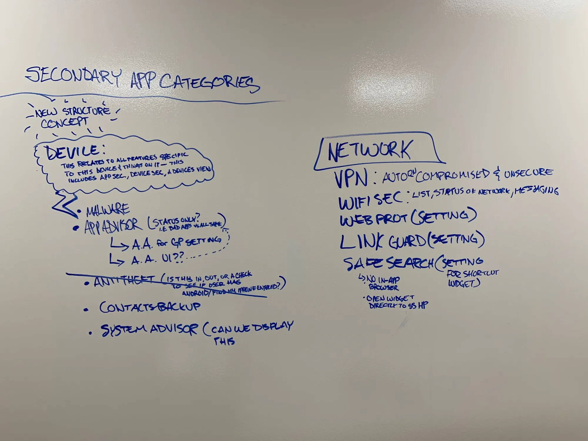
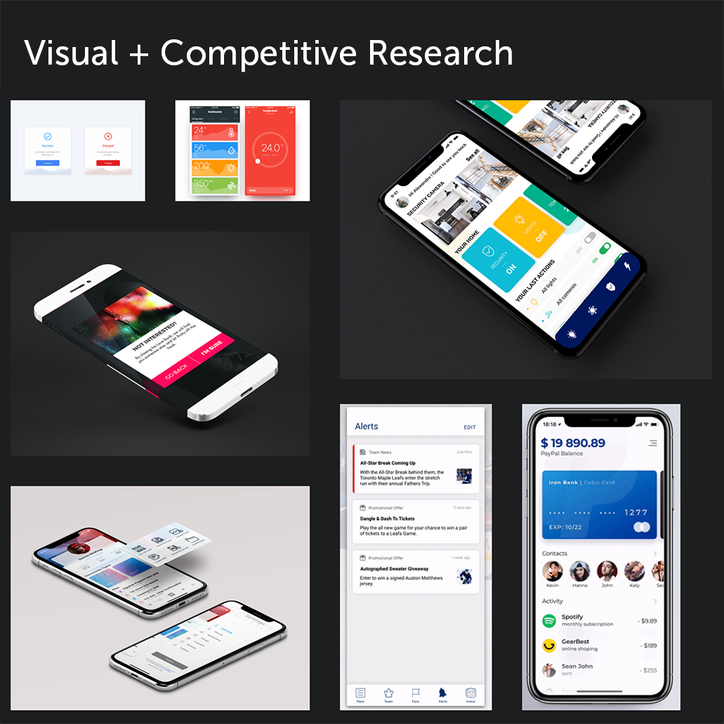
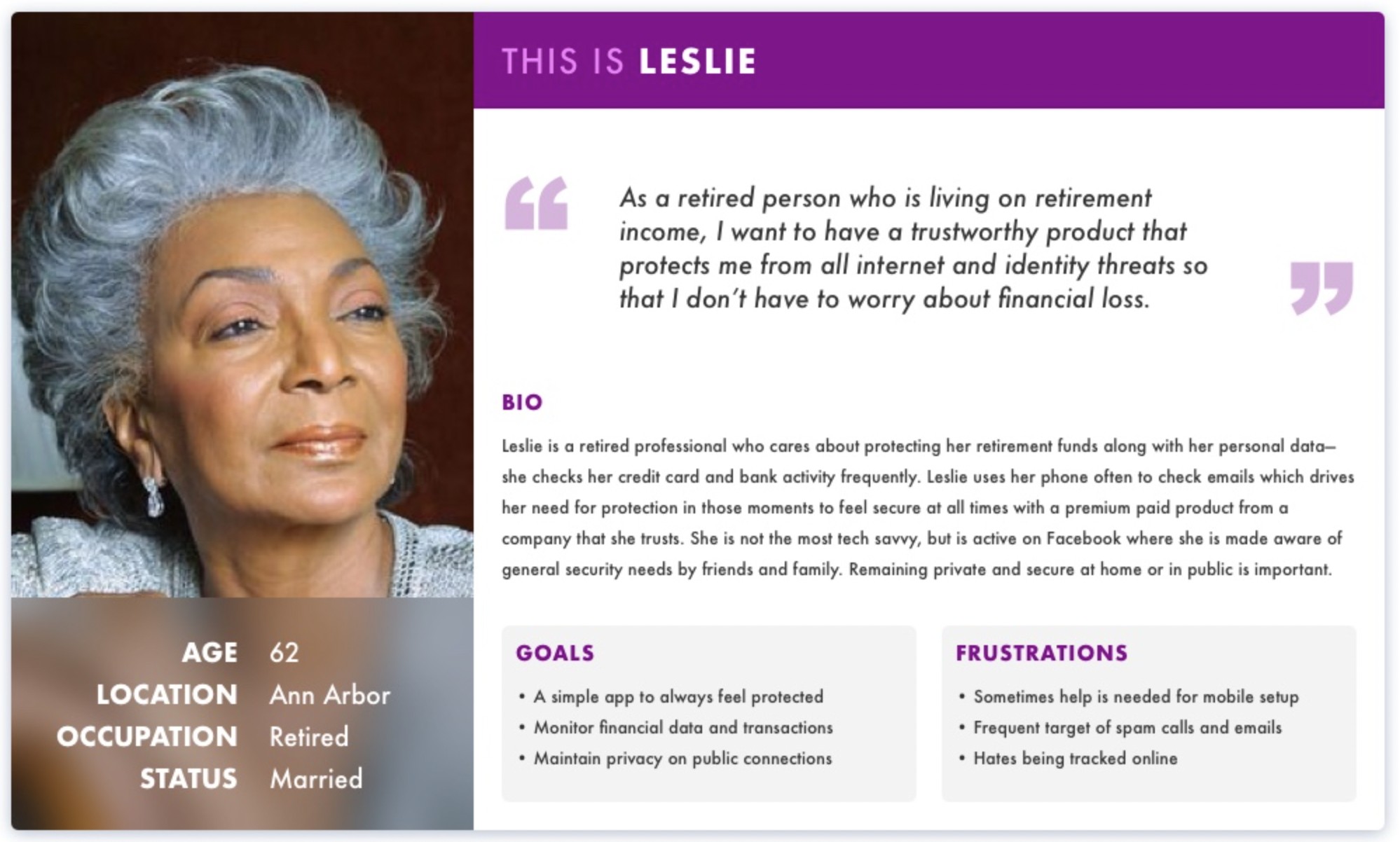
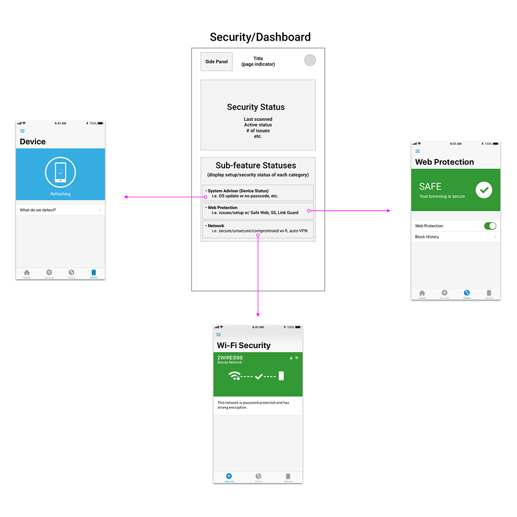
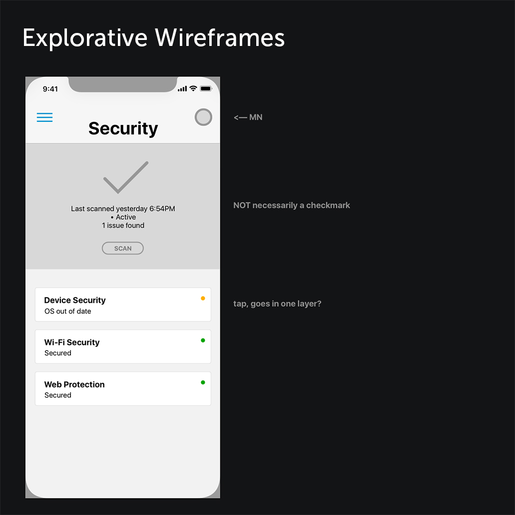
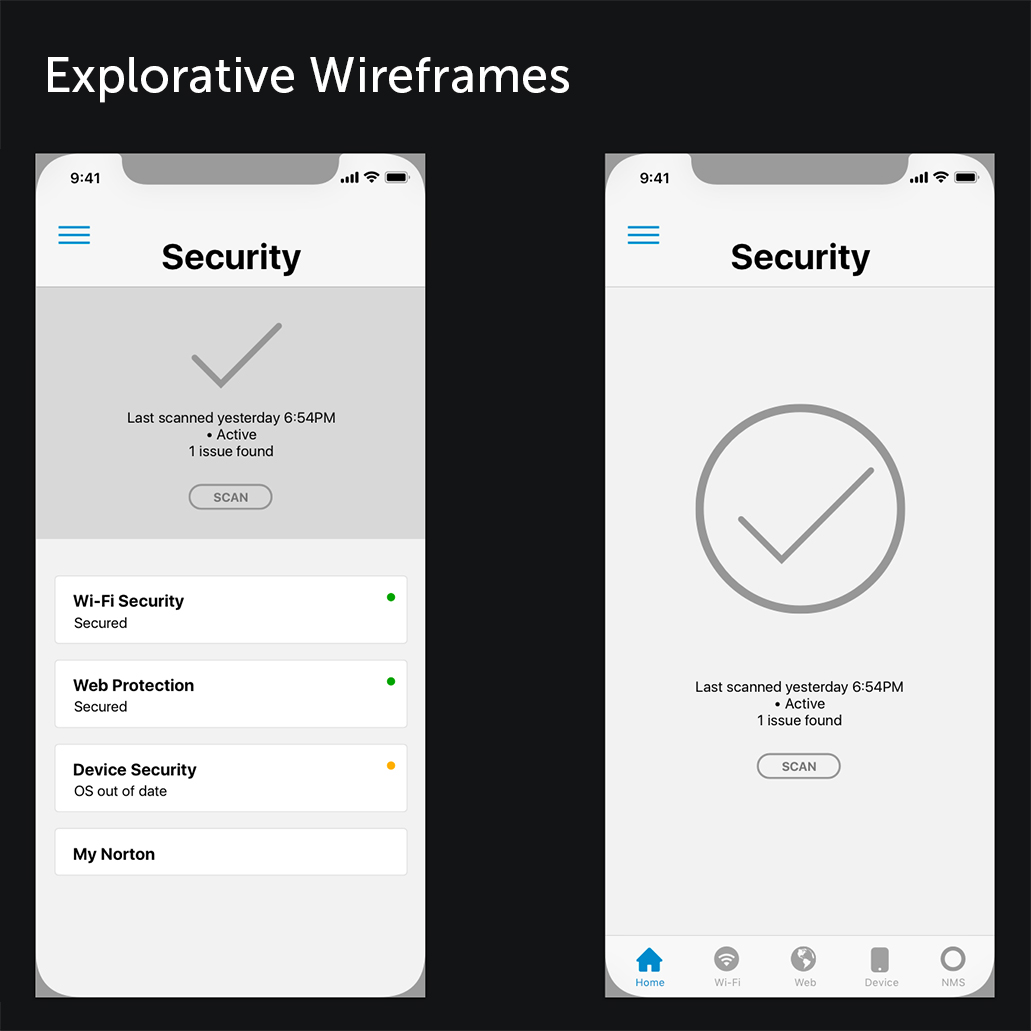
Research: I conducted several user testing, from light user testing to interviews and large scale research, each for different stage of the process. One of the more memorable early-stage testing sessions resulted in a shift of design direction.
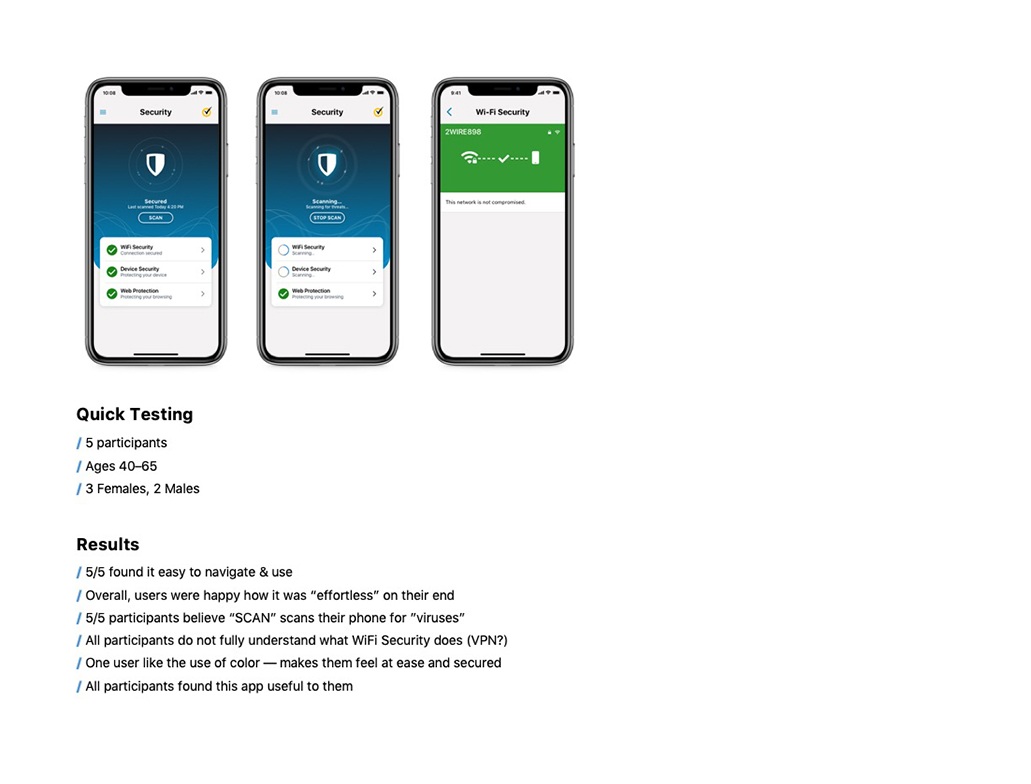
Testing impact: Testing results and interviews with select active customers revealed that the term "Scan" was misleading, causing confusion during prototype testing. As a result, we decided to remove the term entirely. Another key finding was related to our color palette. While one of our design goals was to adopt a more contemporary and appealing look using lighter blues, users responded more positively to muted, darker shades of blue, prompting us to adjust our approach.
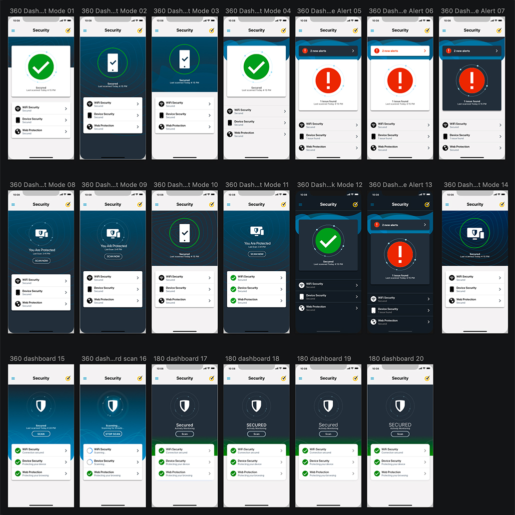
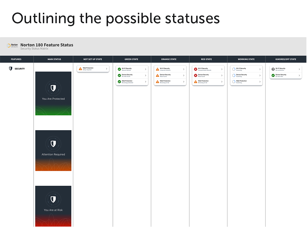
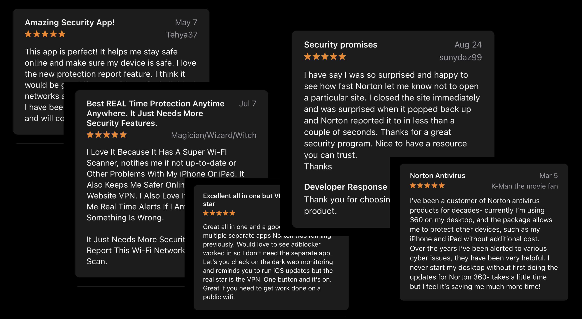
After a comprehensive 10-month effort, the design for the initial release was finalized, paving the way for our first rollout. The update garnered positive feedback overall, with users expressing satisfaction with the improved navigation and refreshed UI. A key highlight was the convenience of accessing all features within a single app, eliminating the need for separate, feature-based downloads. Our subsequent objective is to expand the rollout on a larger scale and consistently enhance designs for future releases.
Aside from positive feedback and reviews from our users, we saw a dramatic increase in conversion rates where users opted in to our subscription model. Our next step was to add more features into our security suite.
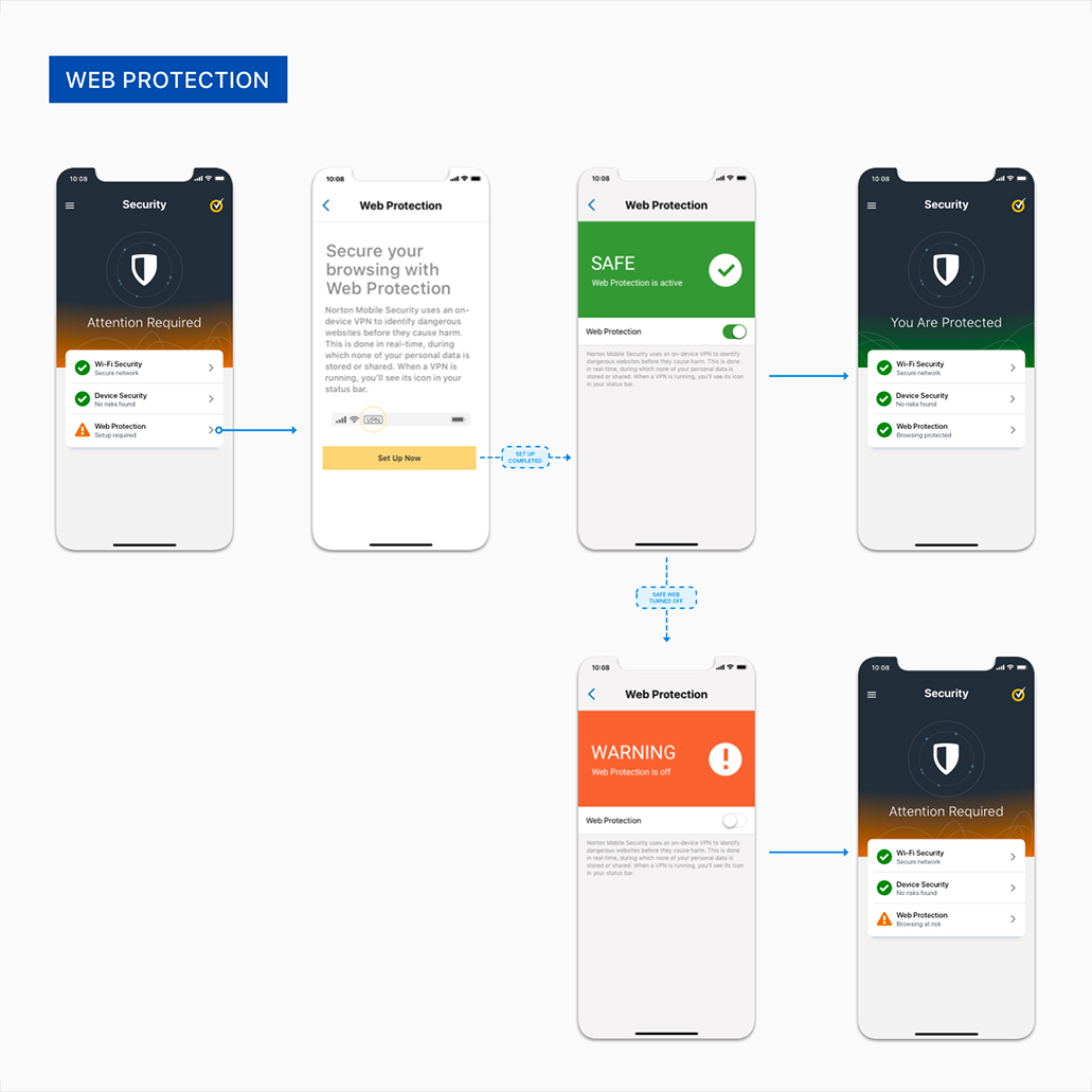
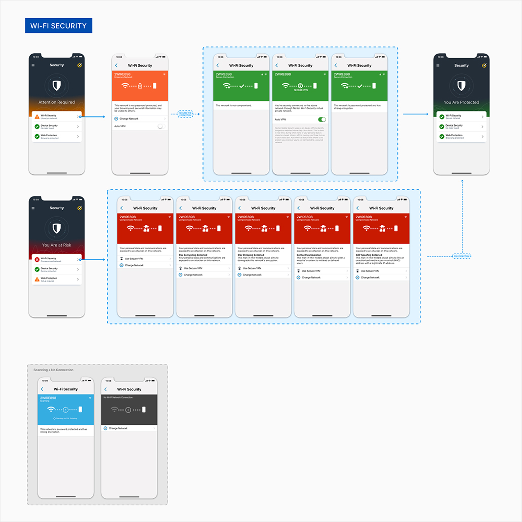
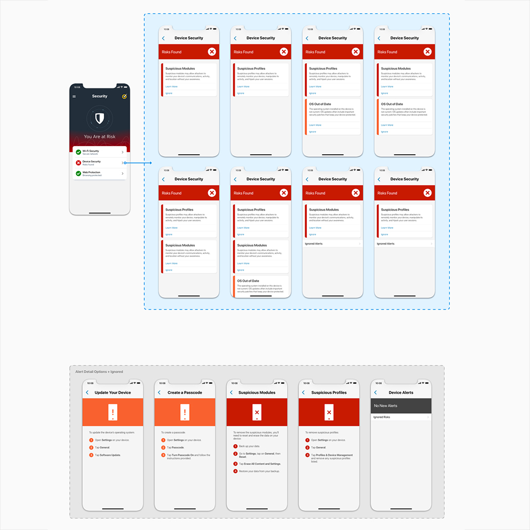
The original design included a broader range of features in the suite, but a month before release, engineering faced significant time constraints and couldn’t complete everything agreed upon earlier. After discussions among design, product, engineering, and leadership, we made the tough decision to scale back the features for the initial release. Although challenging, leadership ultimately decided it was better to launch on time with fewer features than delay the release by six months to include everything.
This required reworking the design. I collaborated closely with the Android design lead to align on a strategy for seamlessly scaling back our offerings in the design files.
After a few weeks, product and design teams convened to review the results from the initial widespread launch. We collected data from the app, customer feedback, and app store reviews. The response was overwhelmingly positive, with some users expressing surprise at the extent of the changes. This feedback led to leadership's approval to extend the update across the majority of Norton's security features.
