Norton (now Gen) is a global cybersecurity company with roots dating back to the 1980s. One of its flagship mobile products, Norton Mobile Security (NMS), offers a suite of security features in a single app—alerting users to vulnerabilities like outdated software or missing passcodes, and delivering peace of mind on the go.
Led design for rethinking subscription flow and assisted PM with tweaking requirements
3 weeks to design
1 PM, 2 devs, and copywriter
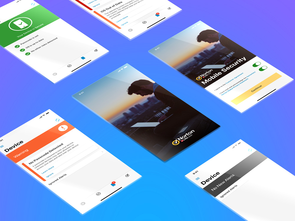
Norton Mobile Security (NMS) was a mobile security product that offered peace of mind for users at their fingertips. Features included password protection and software update notifications.
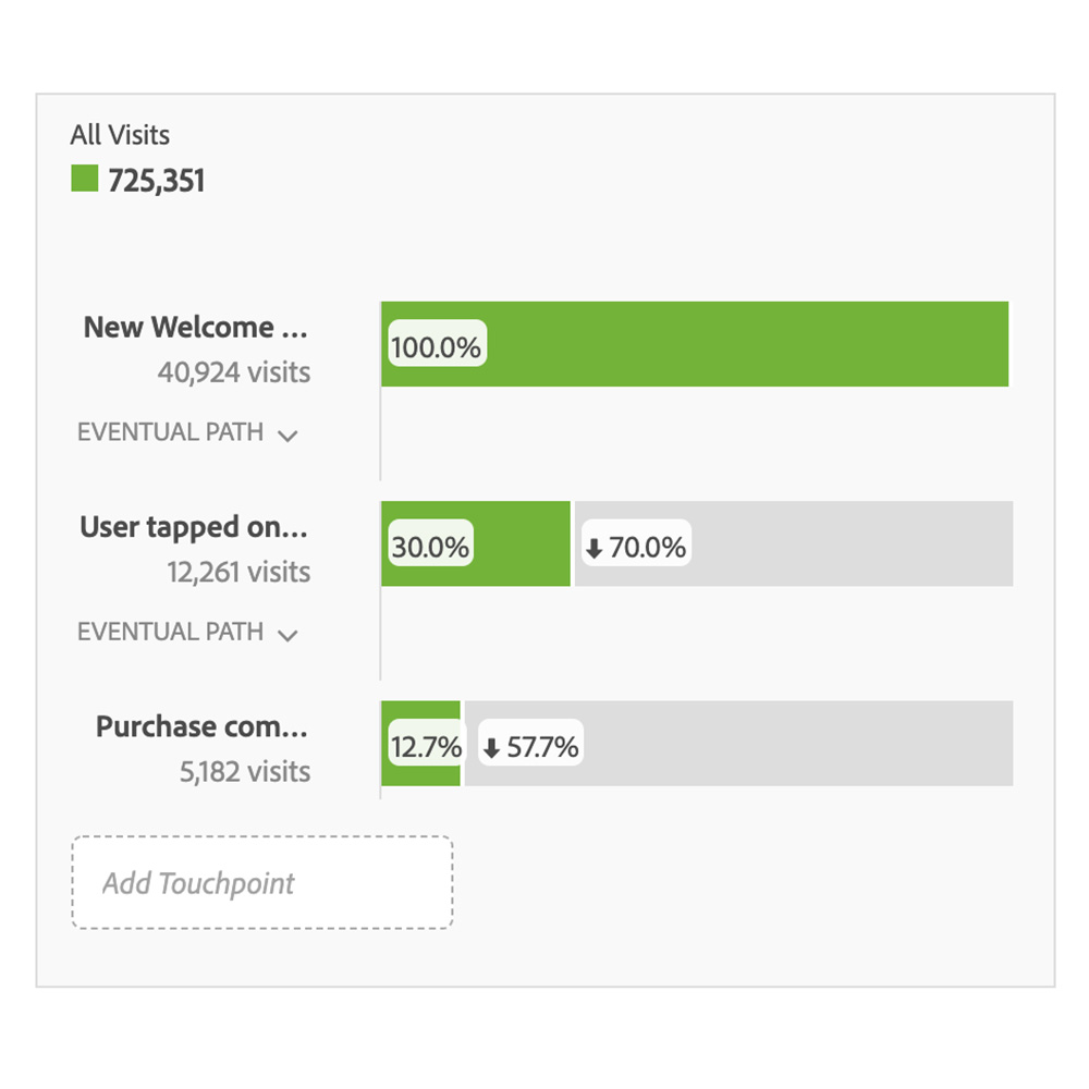
The problem: The product and design teams were first approached by the business with a concern: subscription opt-in rates for NMS were lower than expected. Earlier in the year as part of a strategic shift, Norton transitioned from a one-time purchase model to a subscription-based approach across all products. Unfortunately, the subscription numbers for NMS was not living up to expectations.
The goal: Partnering closely with the PM, I helped lead an exploratory phase to uncover why. We analyzed user data, identified key drop-off points, and began brainstorming solutions to streamline the subscription experience and reduce friction. Our end-goal was to redesign the subscription flow to improve and drive higher conversion rates.
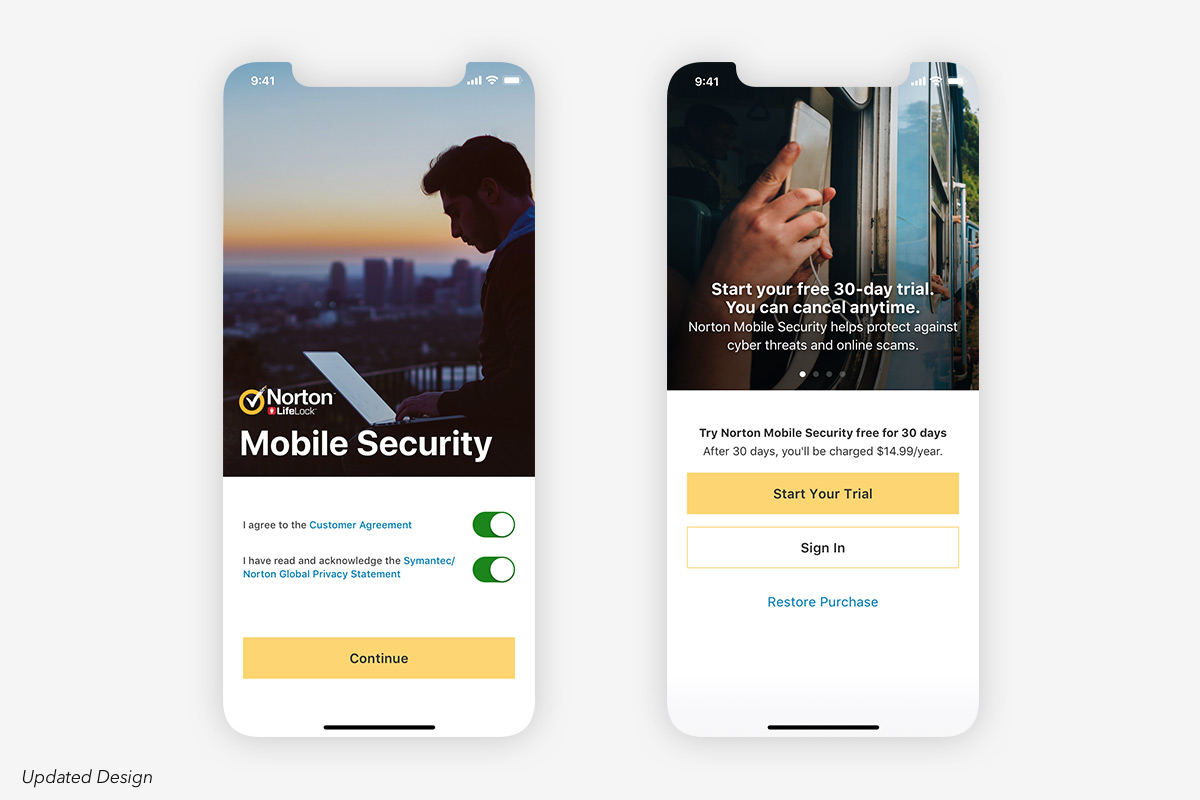
We quickly ran through explorations without wireframes due to an established design system, tight timeline, and because we felt the changes that could lead to higher conversion rates would be minimal changes as the NMS subscription flow was created less than a year prior. During the design process, we not only explored less bombardment of copy, but adding in more imagery to create more breathing space and momentum. We also had to rethink about screen ordering.

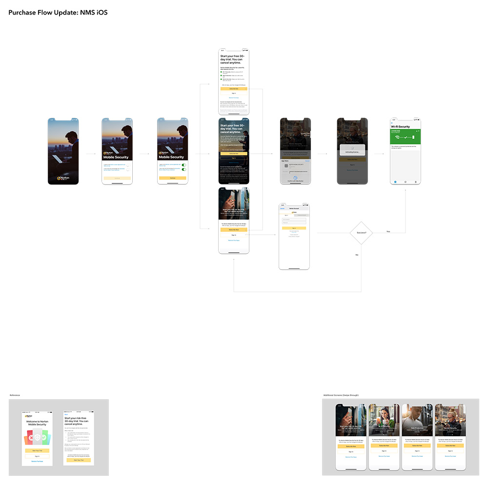
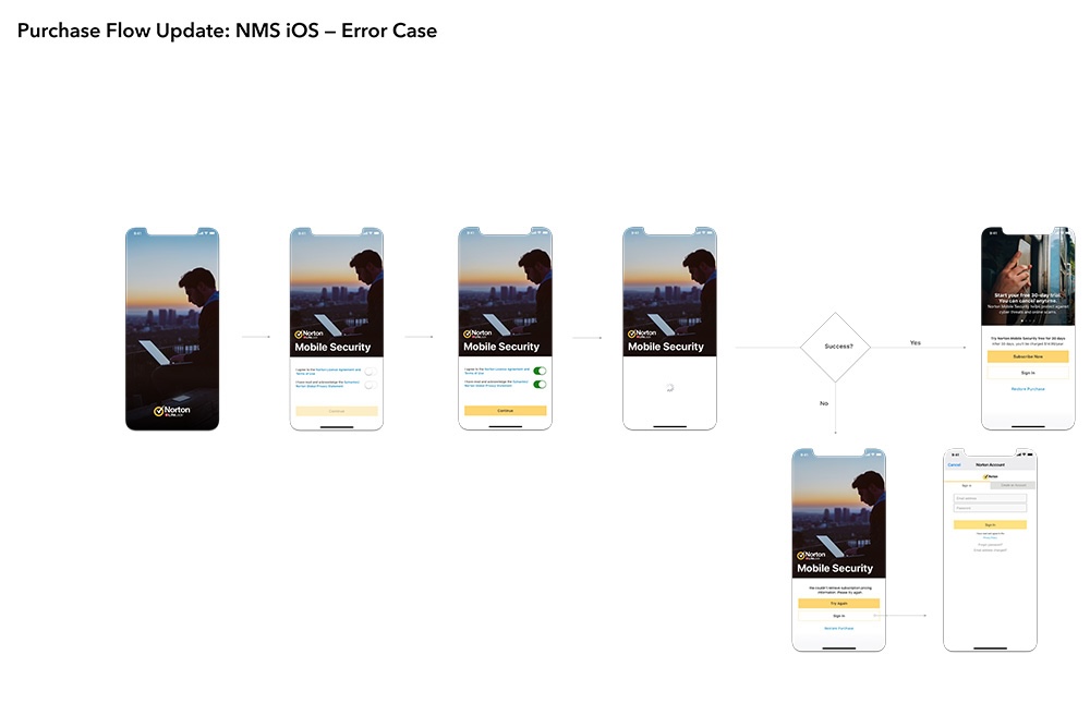
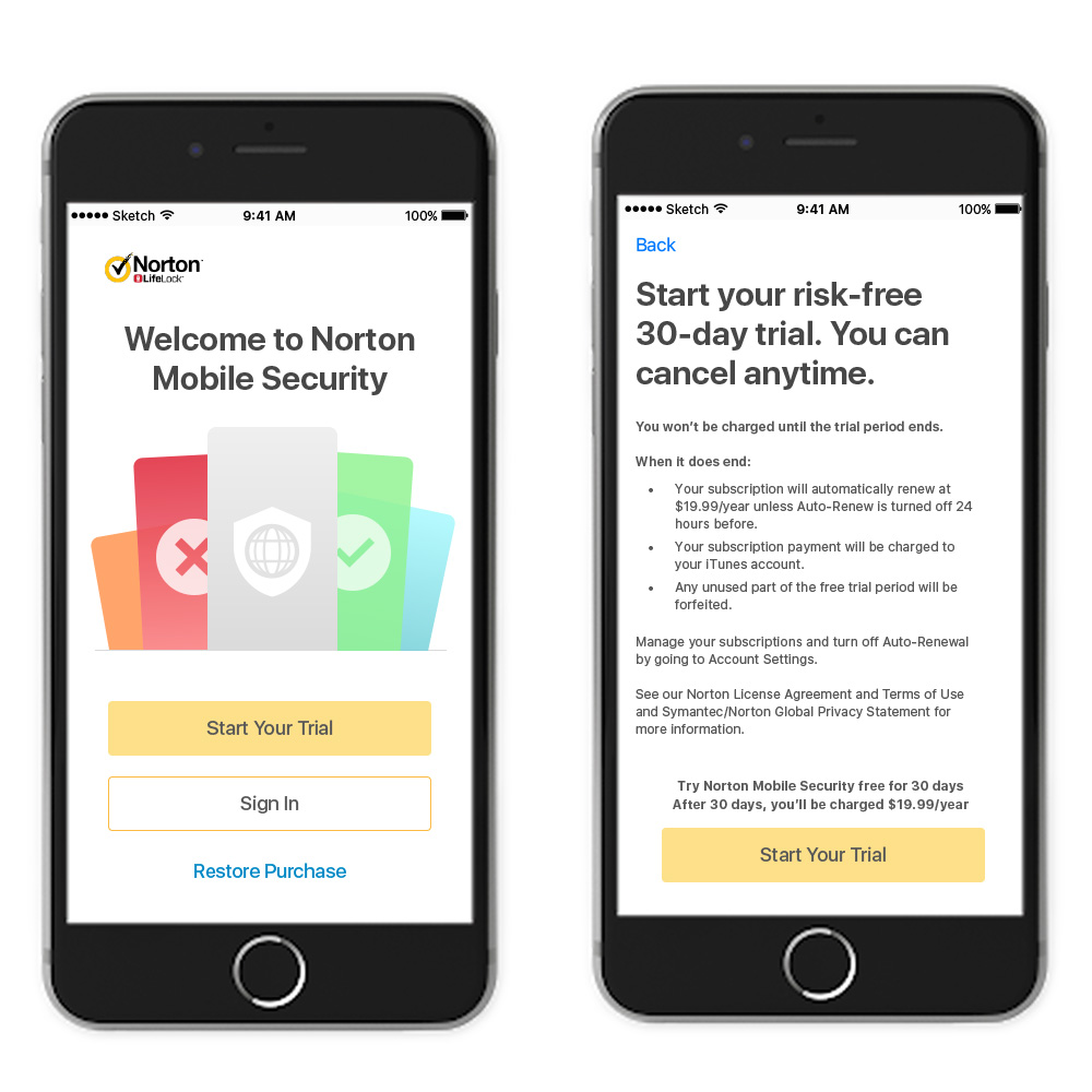
Challenge: One challenge was optimizing screen space. In the original design, users tapped "subscribe" and were immediately taken to a legal screen. In the redesign, we prioritized imagery and the CTA by reversing the order. Users now first agree to the terms, then proceed directly to the subscription/purchase screen, creating a smoother flow.

Despite facing a tight deadline, we successfully launched the updated subscription flow. This led to a notable increase in overall subscriptions, prompting us to reevaluate the subscription model across all Norton products.