Norton 360
Role
[iOS Lead Designer] Planning, Project Scope (Requirements), UX/UI, Testing, Interviews, A/B Testing
Team Makeup
4 Designers (2 iOS and 2 Android), 6 devs, 2 PMs, Product Copywriter
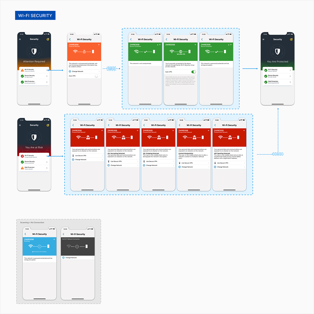
About: A mobile security solution tailored for individuals prioritizing their cybersecurity needs, spanning from safeguarding personal information to enhancing device security. The product aimed to consolidate various security features into a unified, user-friendly experience. This initiative stemmed from feedback gathered from our existing customers, who voiced frustrations over the inconvenience of downloading and repeatedly logging into multiple individual Norton products.
Problem: In our endeavor to merge numerous features and previously separate mobile products into a unified platform, we faced significant challenges. Norton embarked on a rebranding journey following the sale of a portion of Symantec to Broadcom. As part of this transition, we renamed the consumer-facing division, formerly known as Symantec, to Norton — a household name recognized by many. However, we encountered a lack of concrete requirements or a clear roadmap outlining which features and products would be integrated into this new, streamlined offering.
Goal: To create a suite of security products for customers to have all their security features in one app.
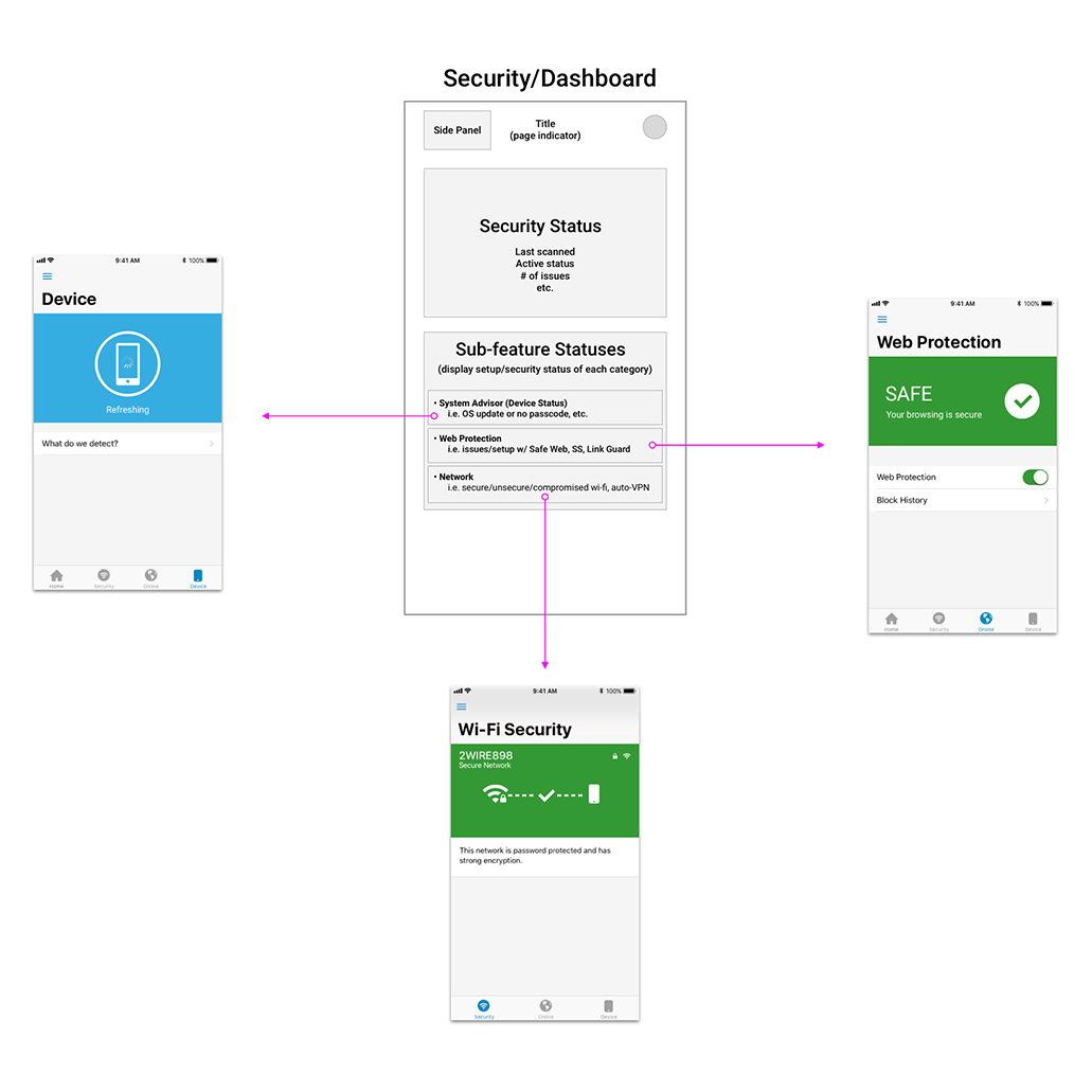
Process: The design team took the initiative to kickstart the ideation process and facilitate discussions. Without established requirements from project managers or developers, and with uncertainty lingering within the design team, we embarked on wireframing, crafting user flows, and envisioning what we deemed to be the optimal security product. Our approach was guided by our understanding of our customers' preferences and security priorities—identifying which products they relied on most and pinpointing their major concerns. This initial brainstorming and exploration phase spanned three months, involving iterative exchanges with project managers and insights gathered from the development teams. Subsequently, we delineated basic requirements and formulated schedules and release plans.
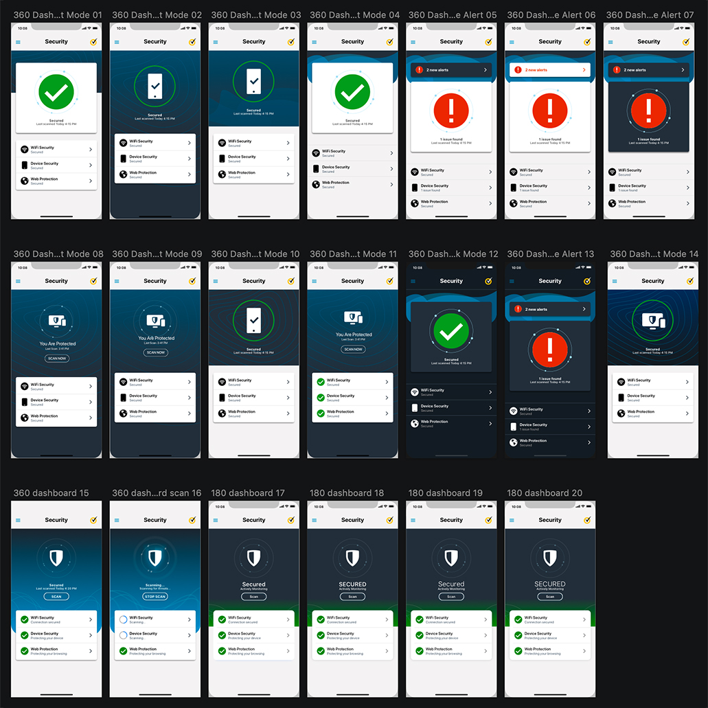
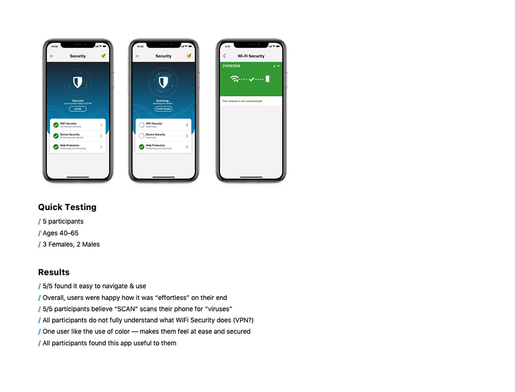
Testing: I conducted several user testing, from light user testing to interviews and large scale research. One of the memorable testing sessions was regarding design direction.
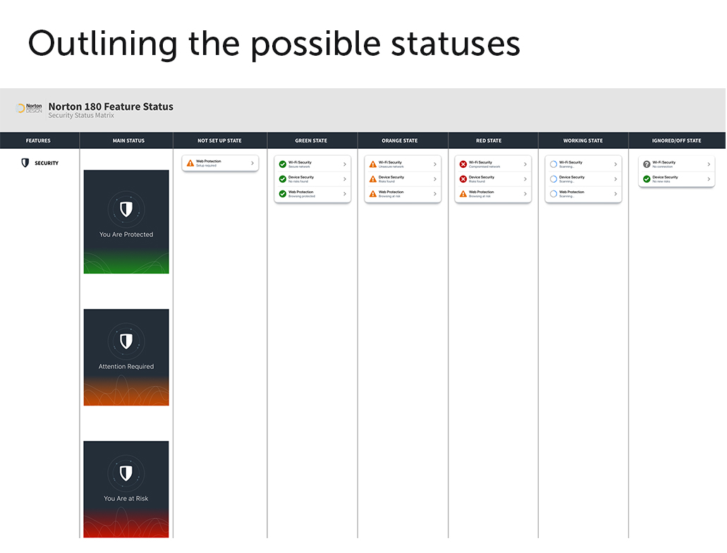
Final: After a comprehensive 10-month effort, the design for the initial release was finalized, paving the way for our first rollout. The update garnered positive feedback overall, with users expressing satisfaction with the improved navigation and refreshed UI. A key highlight was the convenience of accessing all features within a single app, eliminating the need for separate, feature-based downloads. Our subsequent objective is to expand the rollout on a larger scale and consistently enhance designs for future releases.
Results: Aside from positive feedback and reviews from our users, we saw a dramatic increase in conversion rates where users opted in to our subscription model. Our next step was to add more features into our security suite.


