When GO2bank's partnership with Plaid for ACH transfers/direct deposits (DD) was expiring, the product team identified an opportunity to enhance overall user experience. I led the design effort to seamlessly integrate our new partner, Atomic, ensuring the transition was fluid and consistent with GO2bank's user interface, creating a more cohesive and intuitive experience for our customers.
View Figma hereDesign lead: assisted in crafting/refining requirements, created end-to-end experience, and conducted testing
1 month
Product (PM), dev team, product copywriter, marketing, and compliance
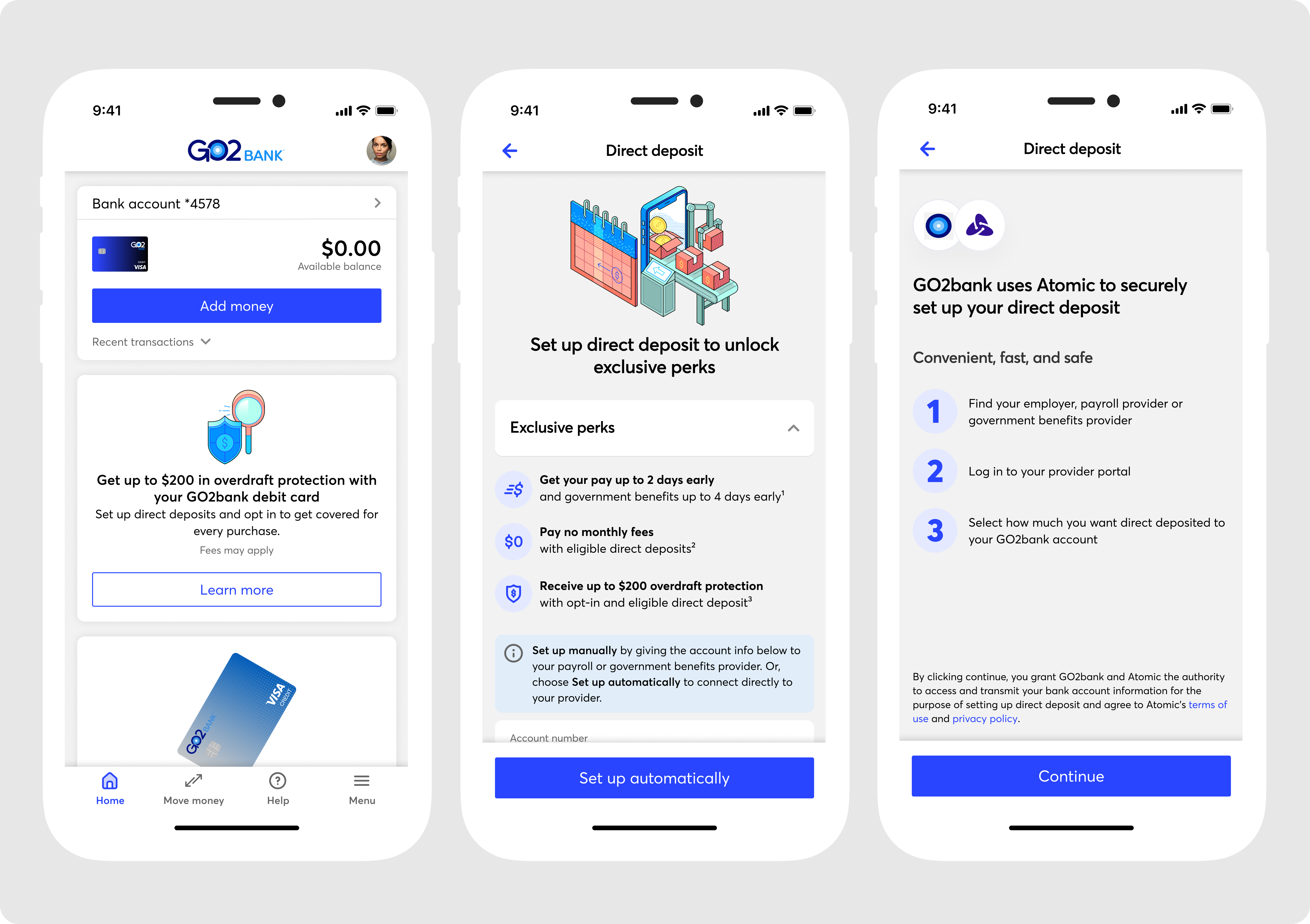
Direct deposit (DD) allows our users to receive their earnings directly from employers, eliminating the need for physical checks and bank visits. To streamline this process, Green Dot collaborates with third-party platforms to help users locate employers and link checking accounts. Initially, the service was powered by Plaid, but with the transition to Atomic, I worked on redesigning the experience to accommodate new requirements, ensuring users could seamlessly connect their employers’ payroll systems to their accounts with ease and efficiency.

The problem: New partnership for ACH/DD led to probable risk of causing disruption to the user's experience when linking up their payroll and bank information. Due to this, new requirements were crafted to support a user's need while leveraging our new partner's platform and technology.
The goal: Redesigning the experience to accommodate new requirements, ensuring users could seamlessly connect their employers’ payroll systems to their accounts with ease and efficiency, while not impacting feature retention.
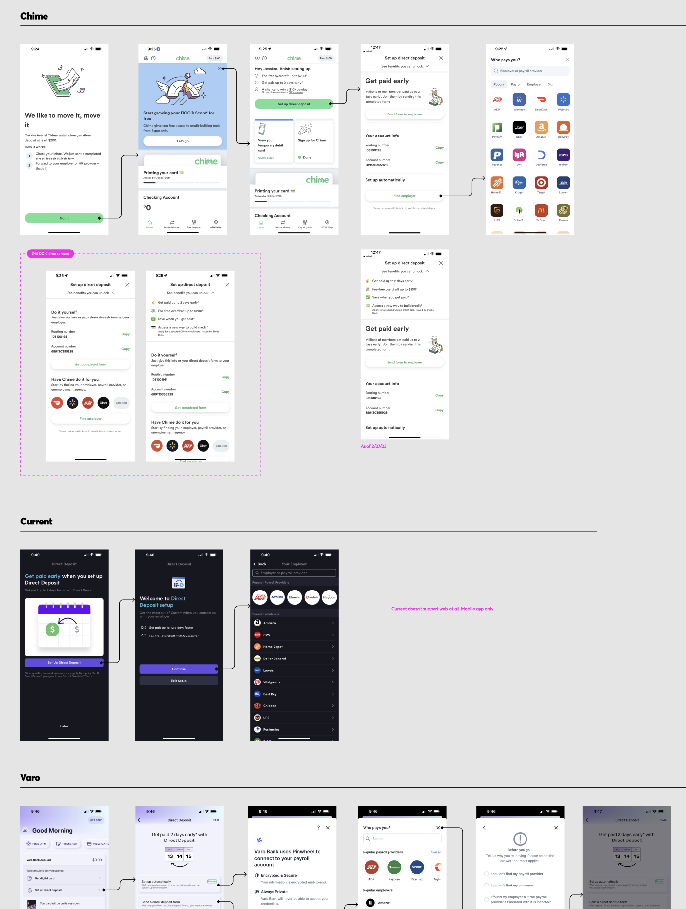
First round research: After collaborating with the product team to review requirements, I conducted research to validate if they met user needs. I assessed what worked, identified areas for improvement, and benchmarked our approach against competitors. During this discovery, we found key elements on the existing DD landing screen that were effective, leading us to forego certain changes, such as copying account and routing numbers. We also noted competitor strategies, like using separate panels to distinguish between finding an employer and manually entering information in a direct deposit form.
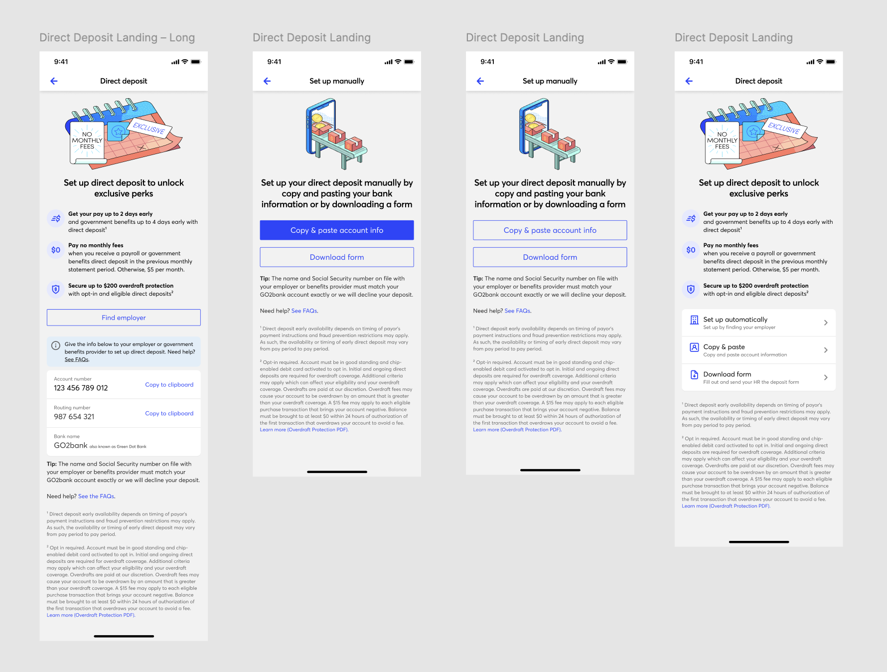
Explorations: After getting a better understanding and grasp around DD, our users' needs, and further refining requirements with product, I began exploring ideas quickly. Rather than sketching out wireframes, I utilized the components in our component library to quickly drop in elements and ideate options. I first began with pre-setup landing screens, where user will get more information about DD and their information.
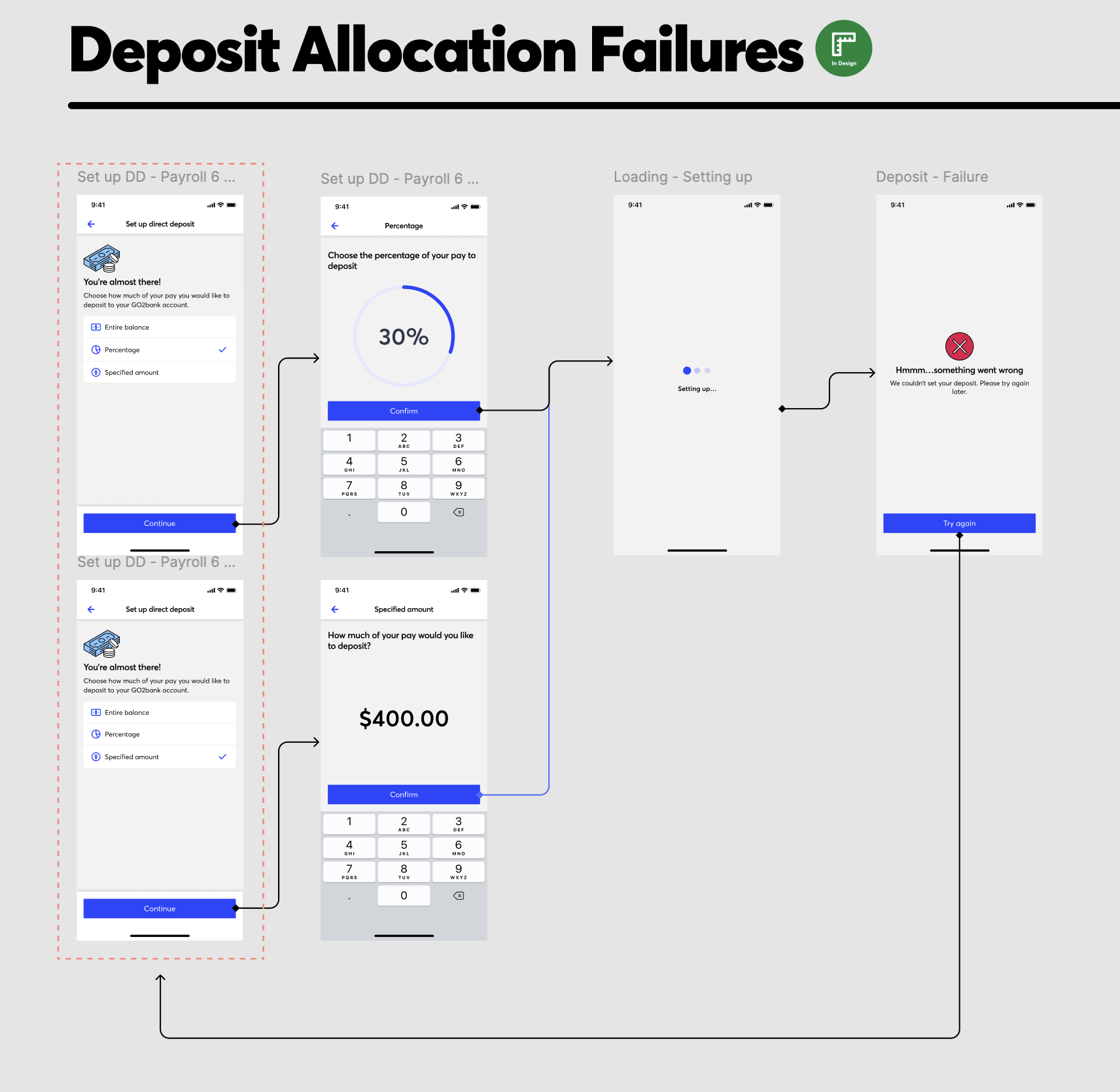
Curve ball: Following multiple iterations and two rounds of testing, I received feedback from product and development teams indicating that some of the mockups and user flows that were mapped out were going to be no longer necessary. After our finance and business team engaged in further discussions, the details surrounding our contract and terms of service shifted. Product relayed the information to the dev team, who quickly discovered that several of the designed experiences were soon to be supported by Atomic's API.
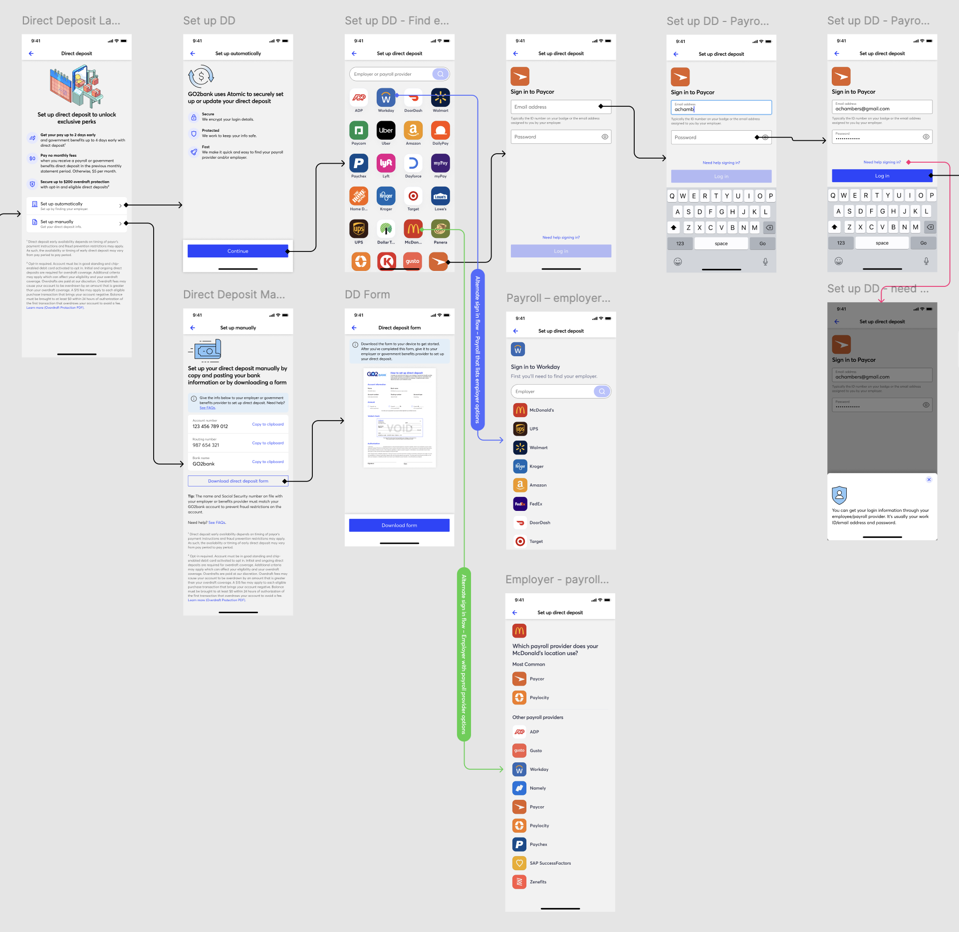
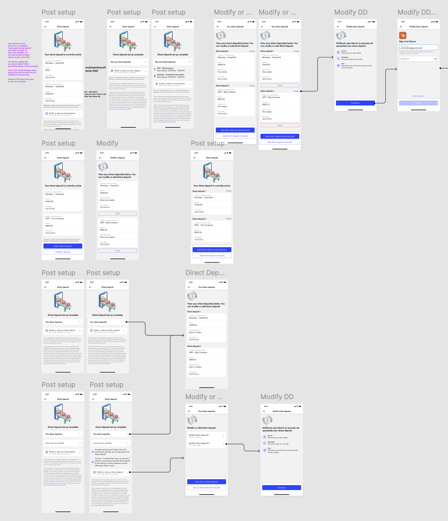
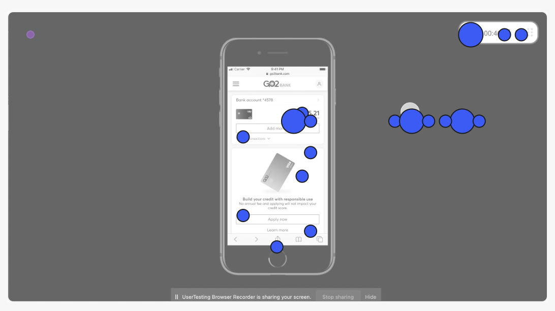
We conducted multiple rounds of usability testing throughout the iteration process, incorporating both quantitative and qualitative methods, and user interviews.
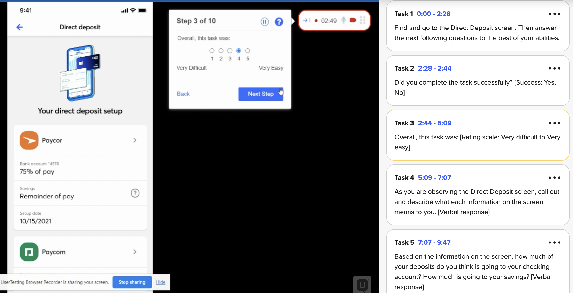
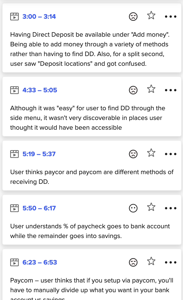
In the initial testing phase, users did an AB test between the then live and proposed designs, reviewing various prototypes and identifying features that improved usability and areas needing enhancement. This feedback guided the team on design and copy direction. Mid-stage testing focused on refining the overall experience and improving users' comprehension of information blocks. In the late stage, we conducted usability testing and user interviews to finalize details, verify we met requirements, and evaluate our progress towards our goal.
Overall, our validation process acted as a critical checkpoint in the design journey, keeping us aligned with not just design, but requirements, the language used (product, marketing, and compliance copy), and our business goal.
— SONGBIRDMYST (Female, Age 33)
Since launching the update, we observed a slight increase in users opting into our direct deposit (DD) feature compared to the pre-redesign phase. We attribute much of this success to the improved experience provided by Atomic versus Plaid, particularly for ACH/DD features. However, data demonstrated that the update/redesign to the direct deposit landing screen played a significant role in retention and enhancing user experience. Additionally, we received live feedback from active users highlighting the ease of processing information and the transparency regarding their automated deposits.
